Category Archives: News

Tala Fustok designs Ninja Theory office to entice employees back into workplace

A blood-red bar and all-blue cinema room feature in the Cambridge headquarters of BAFTA-winning game developer Ninja Theory, with interiors designed by London studio Tala Fustok.

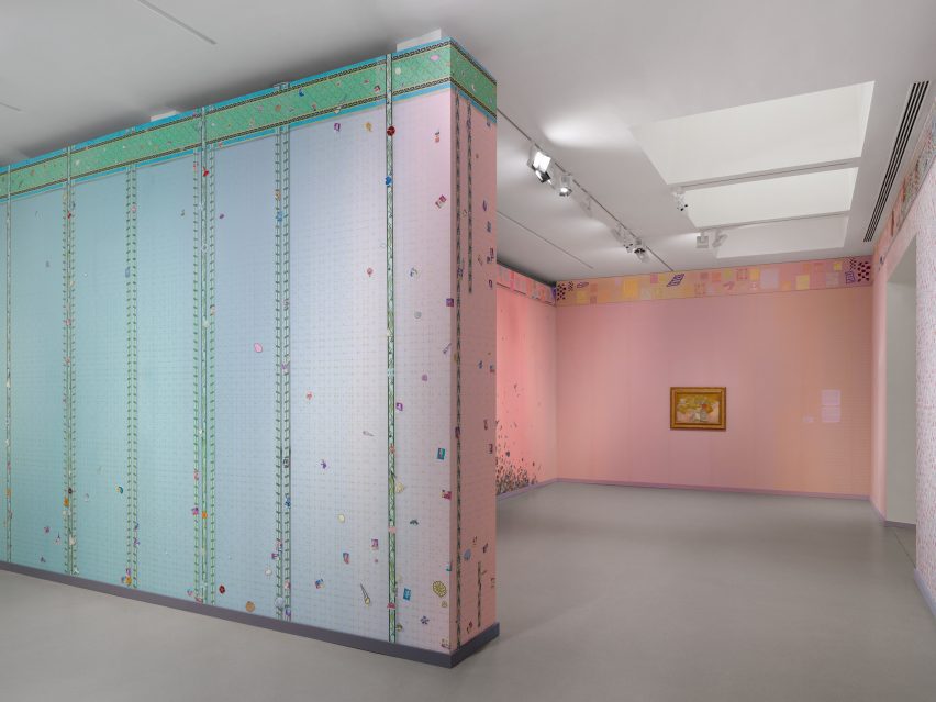
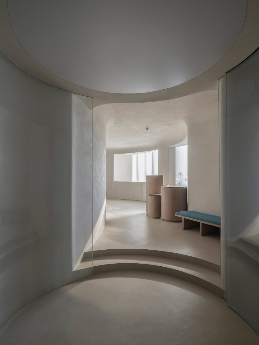
Set over four floors, the 2,325-square-metre office was designed to look like a lavish home or entertainment venue in a bid to encourage employees to return to the workplace after a year spent working from home.

A large meeting table with rattan dining chairs
Ninja Theory’s headquarters are accented with dark jewel tones including forest green curtains (top and above)

“With work-life boundaries becoming blurry, and as employees get more comfortable working from home, expectations for comfort and flexibility in the office environment are rapidly increasing,” Tala Fustok explained.

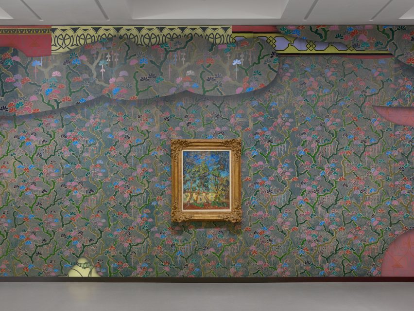
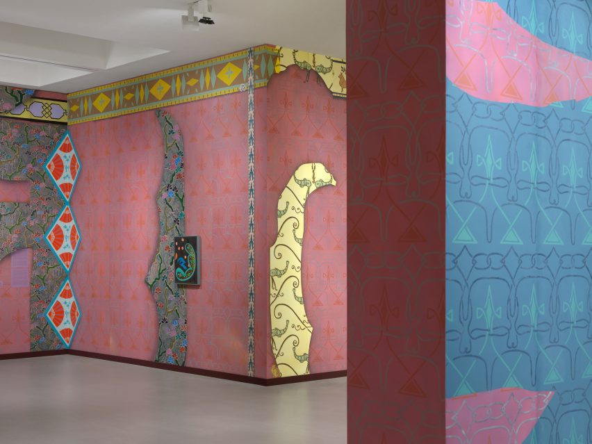
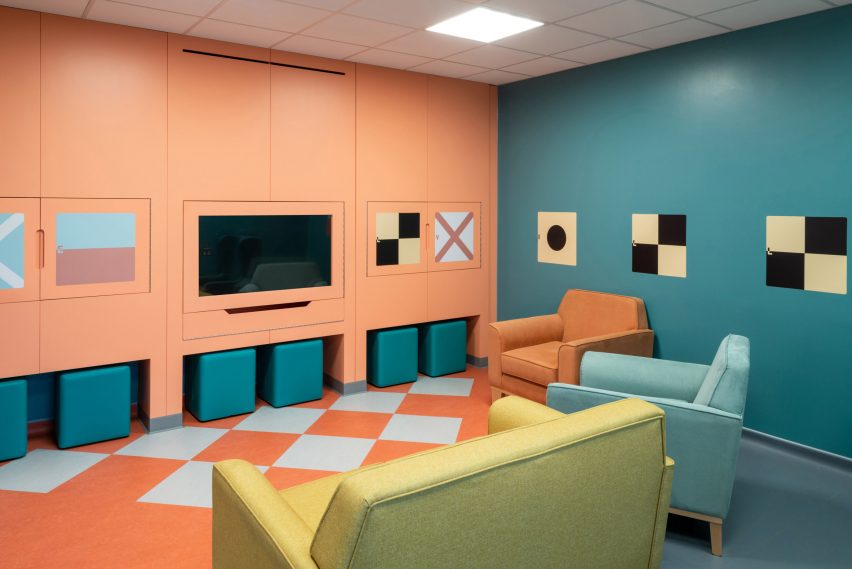
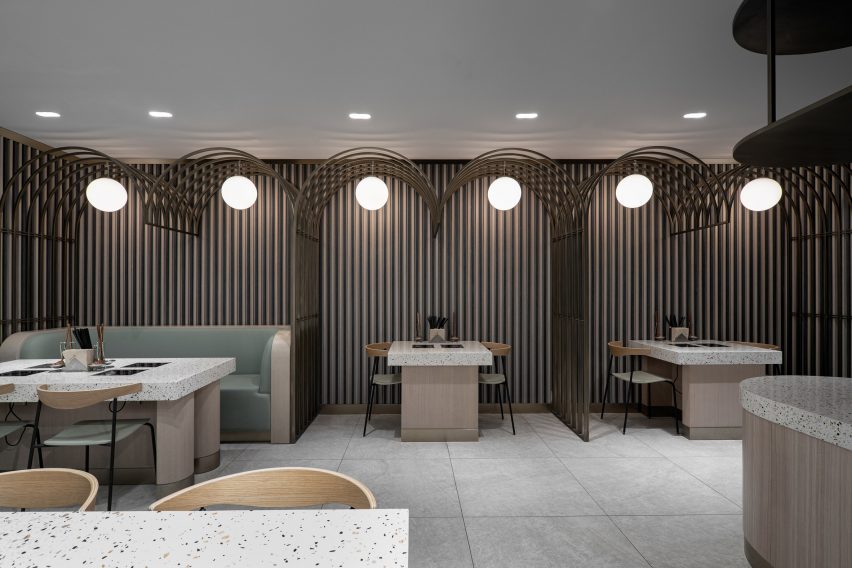
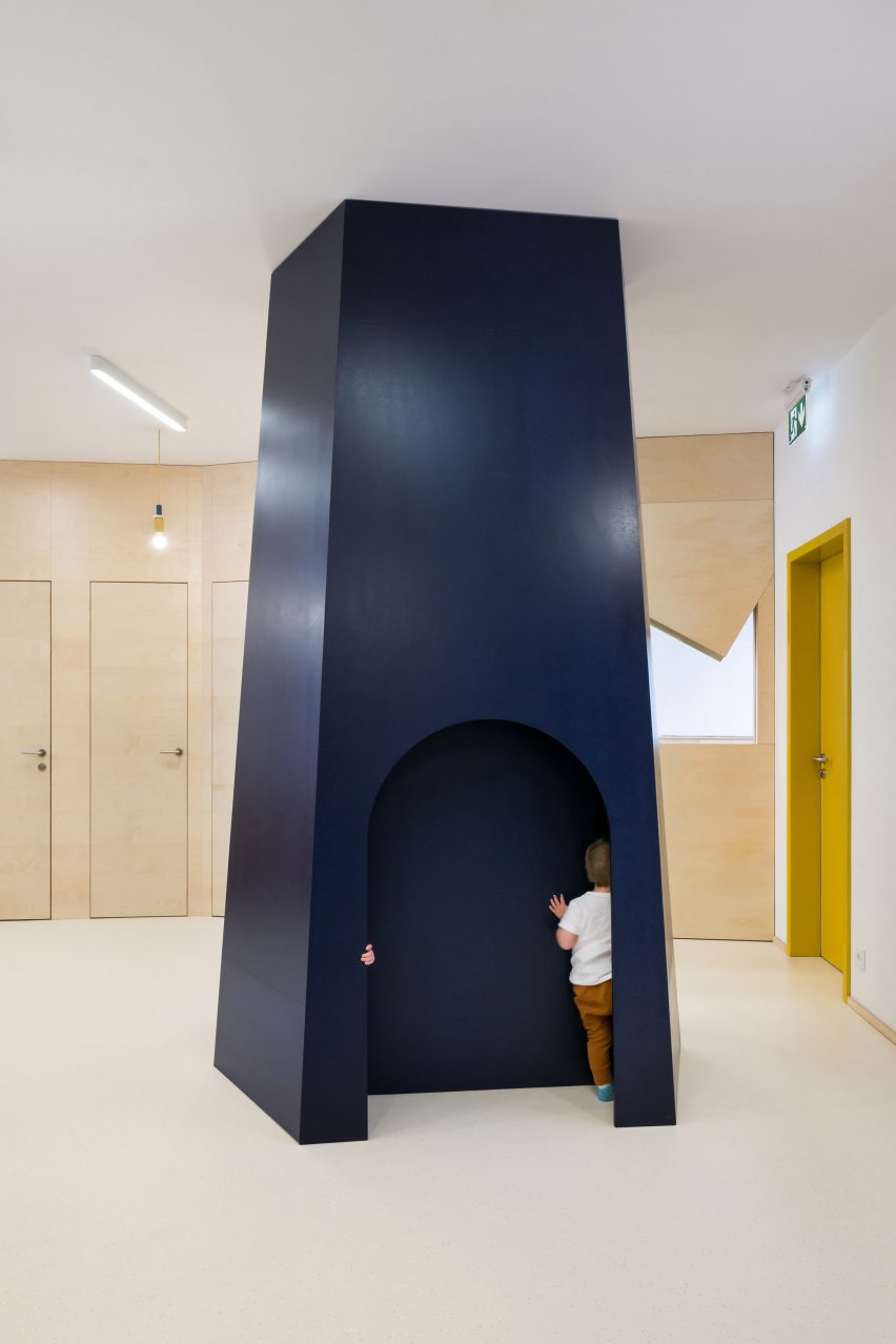
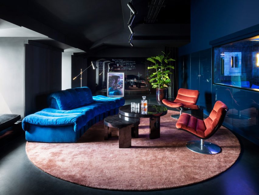
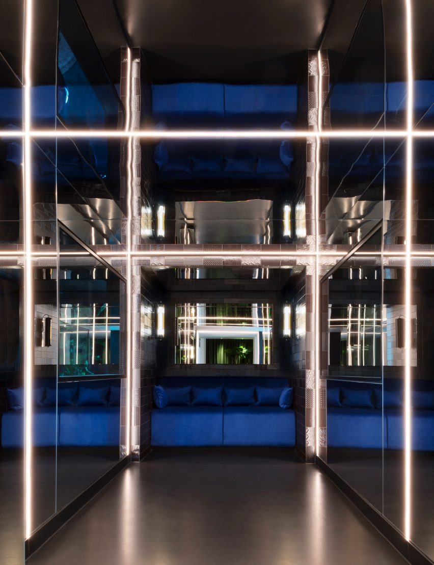
The studio used a palette of dark jewel tones to accent the interior, sometimes even covering entire rooms to create immersive environments reminiscent of the virtual worlds developed by the games company.

A bar area is adjoined to a large meeting table
The office features multiple bars for socialising

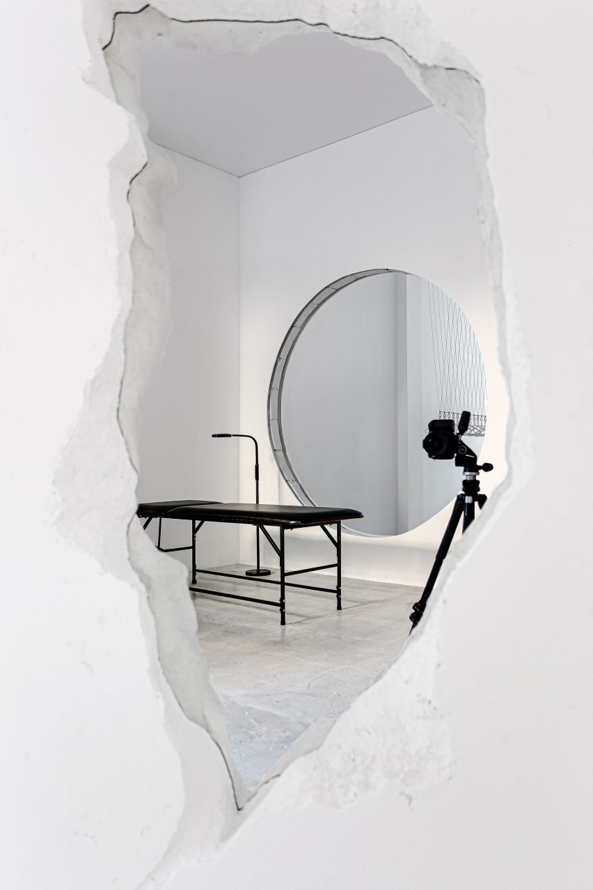
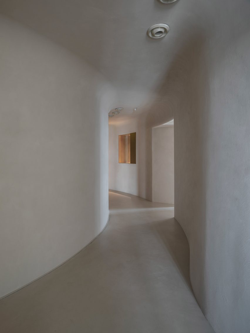
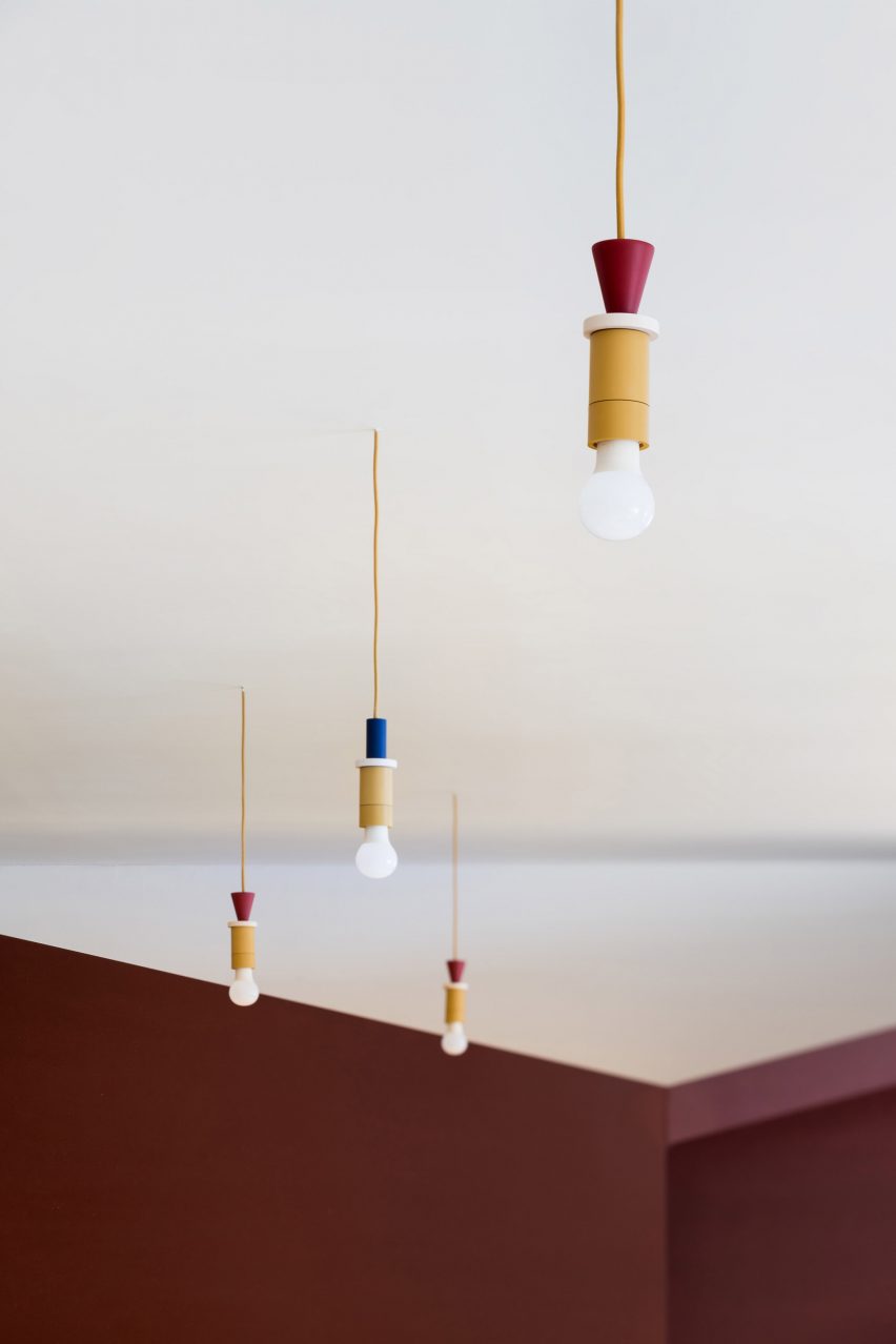
Employees enter the office through a dimly lit lobby with polished black concrete flooring and neon lighting, which Tala Fustok says helps to create the feeling of stepping into another dimension.

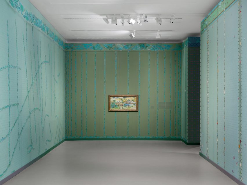
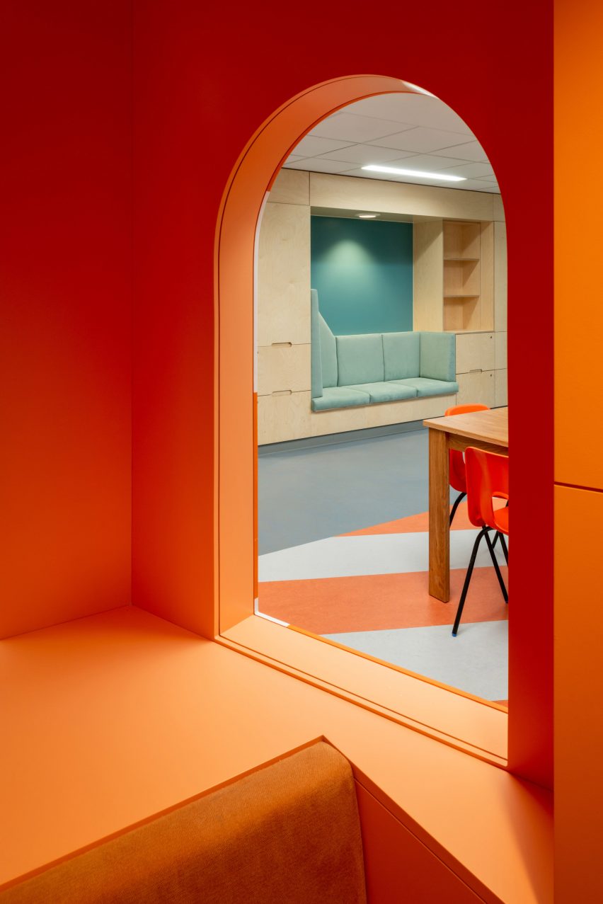
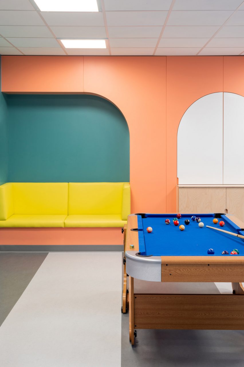
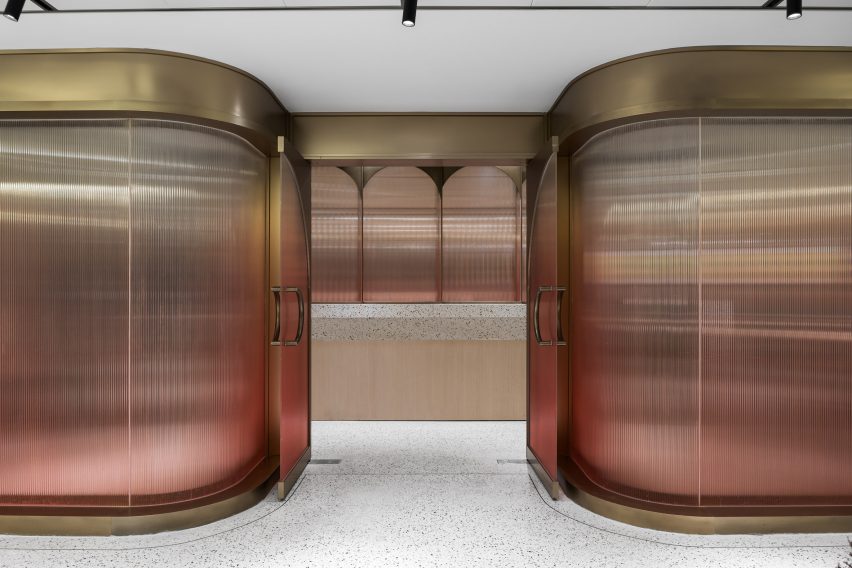
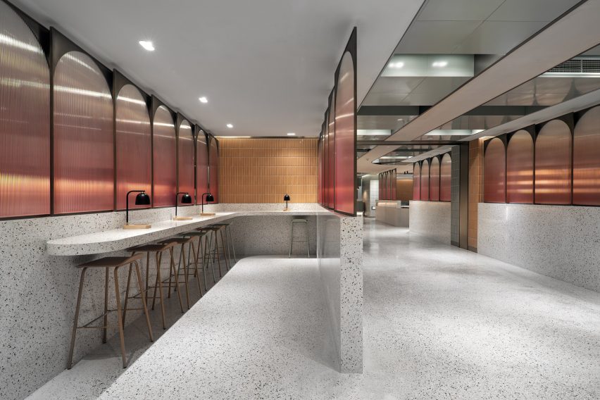
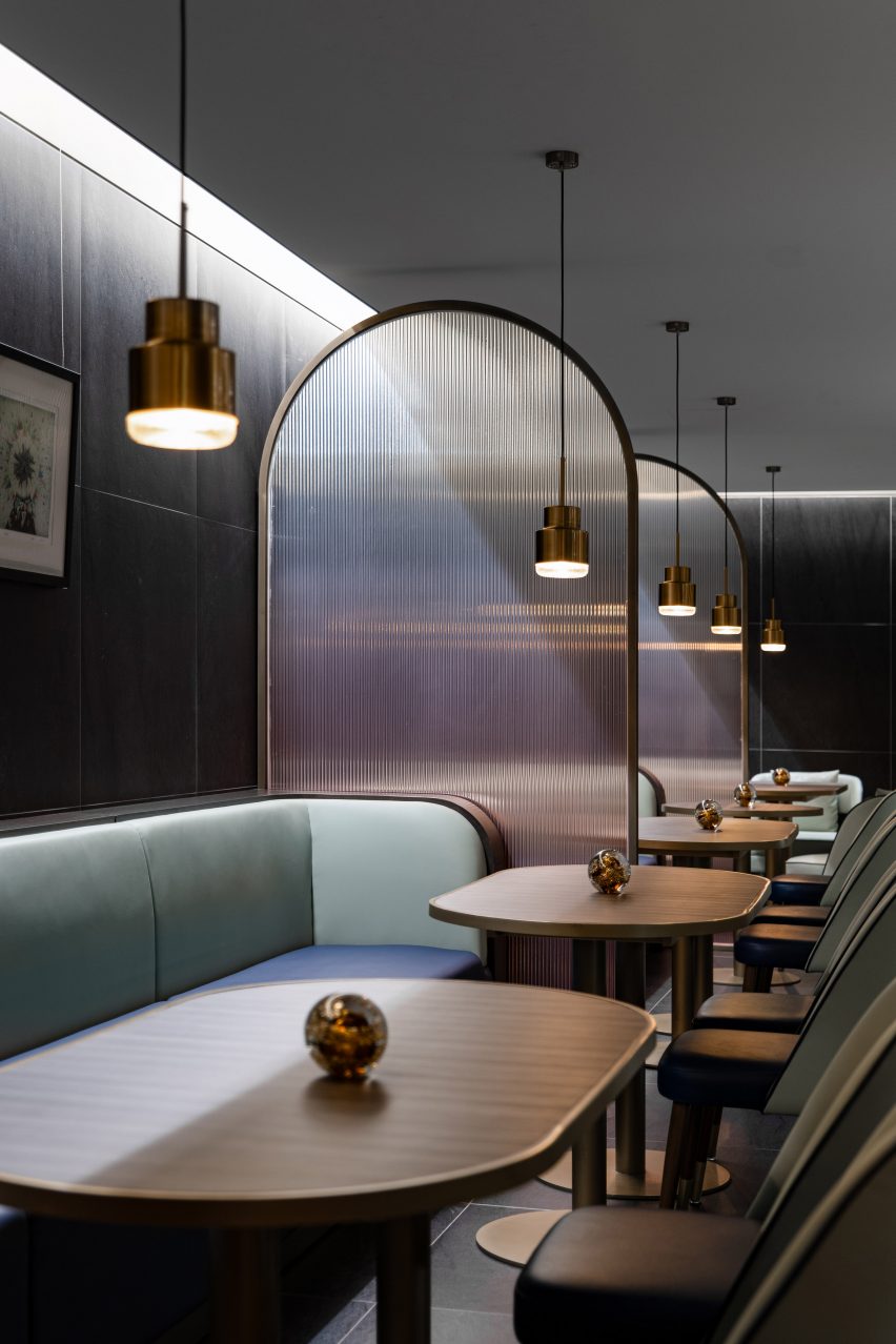
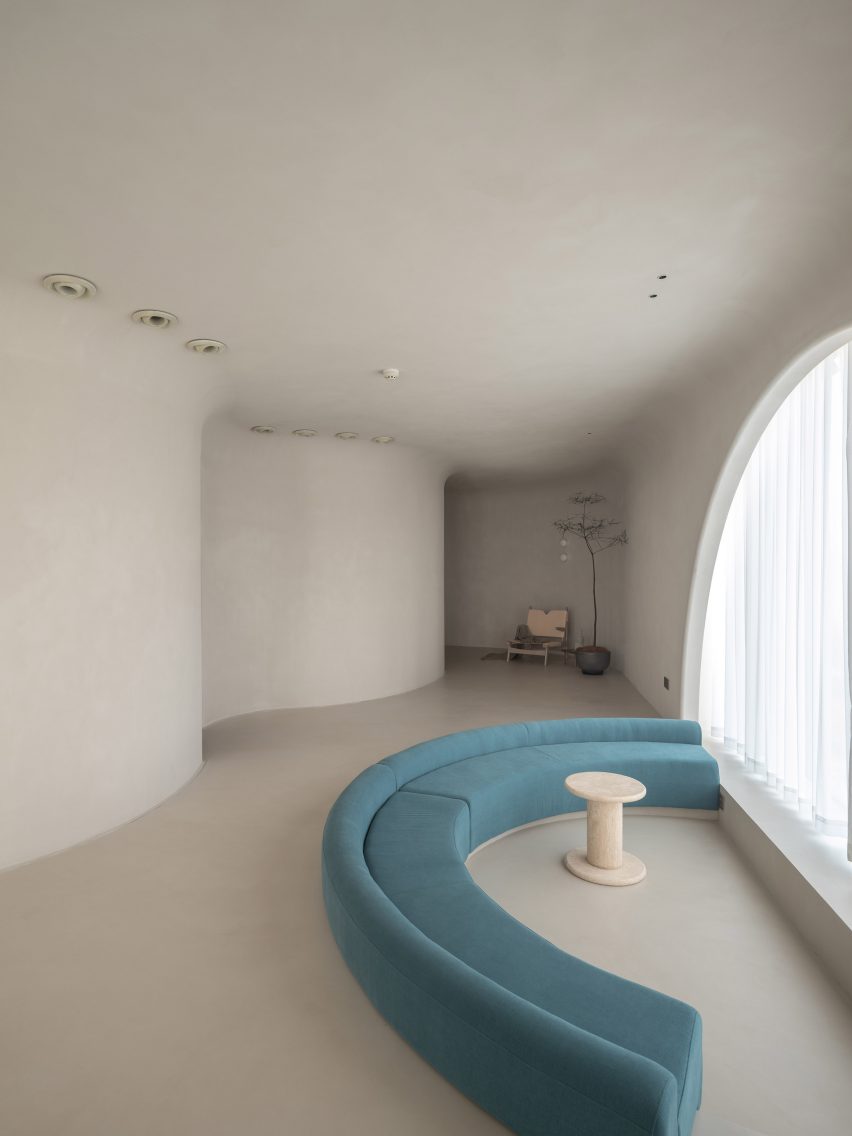
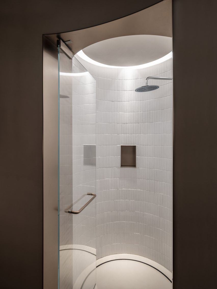
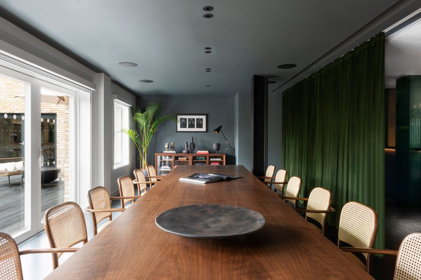
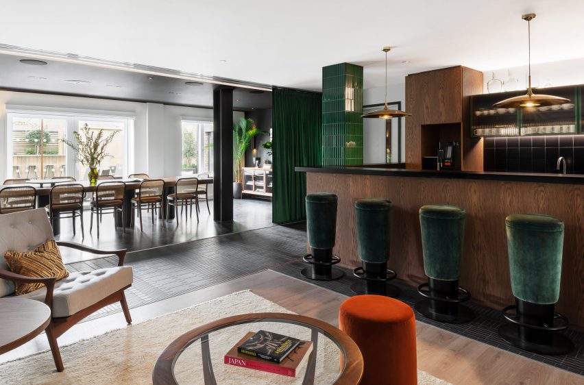
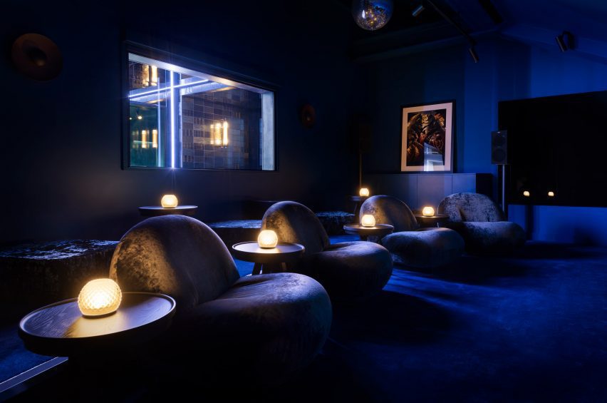
Other colour-coded spaces include a green room for motion capture, the all-blue cinema and the red bar, where silk-sheen carpet covers the floor, walls and ceiling to continue the otherworldly theme.

A bar space has a bright red hue
Carpet covers the floors, walls and ceilings of the red bar

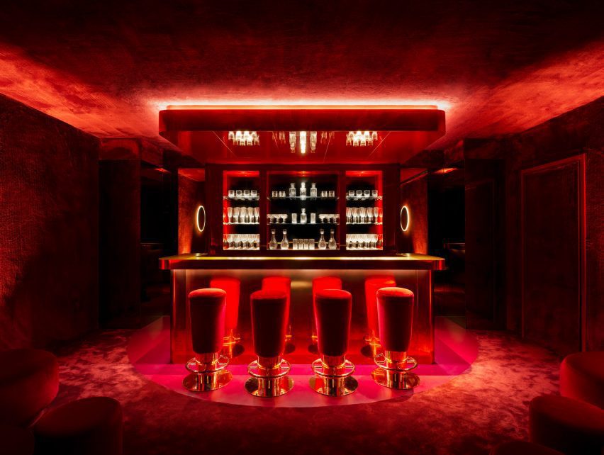
According to Tala Fustok, the different colours were used not just for their visual impact but also in the hopes that they would have a positive impact on the mood of those occupying the spaces.

“Red is for energy and green brings in a natural element,” the studio told Dezeen. “We included this in the meeting rooms and throughout the terrace. And blue, which we used in the cinema room and offices, gives a feeling of calm.”

A cinema room is dimly lit
The office has a cinema room

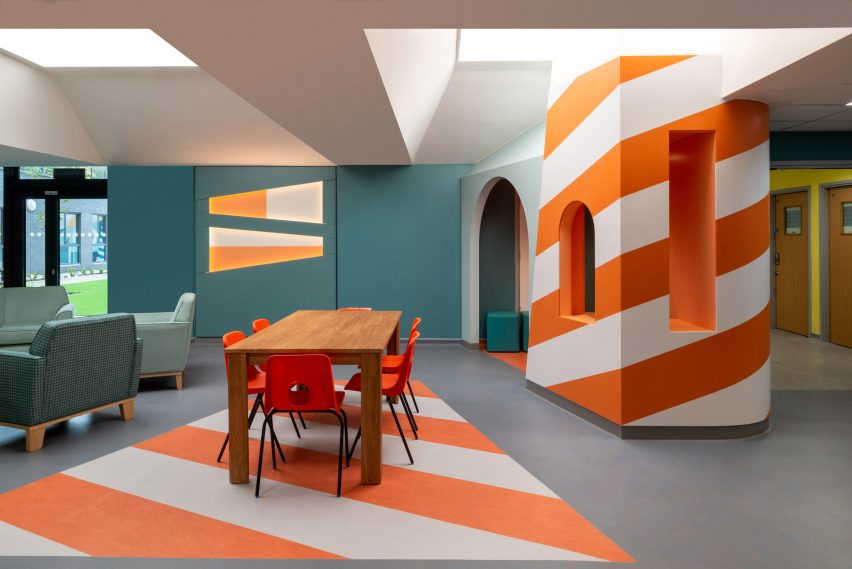
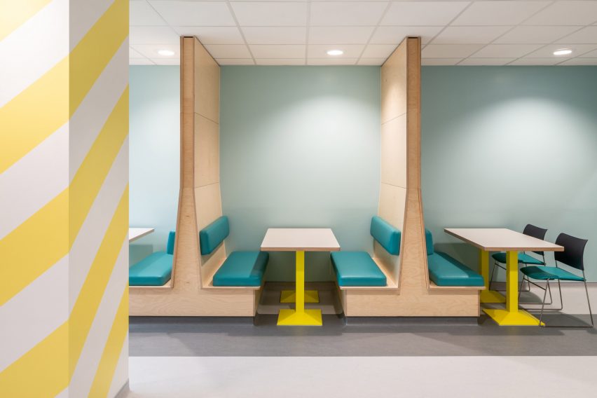
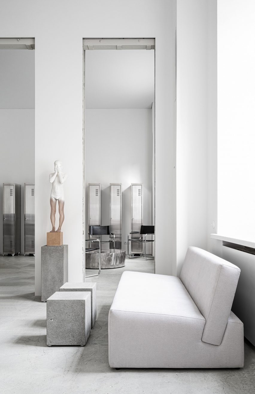
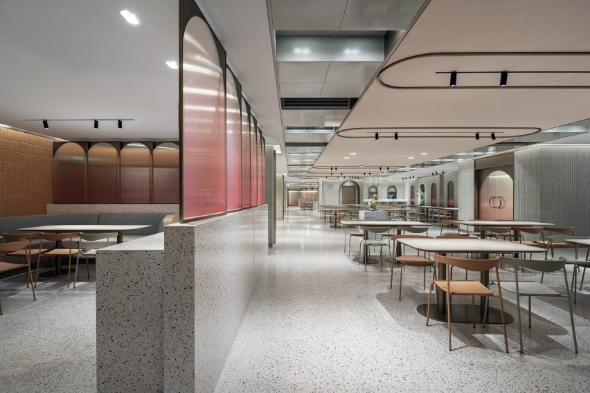
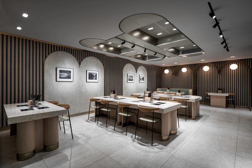
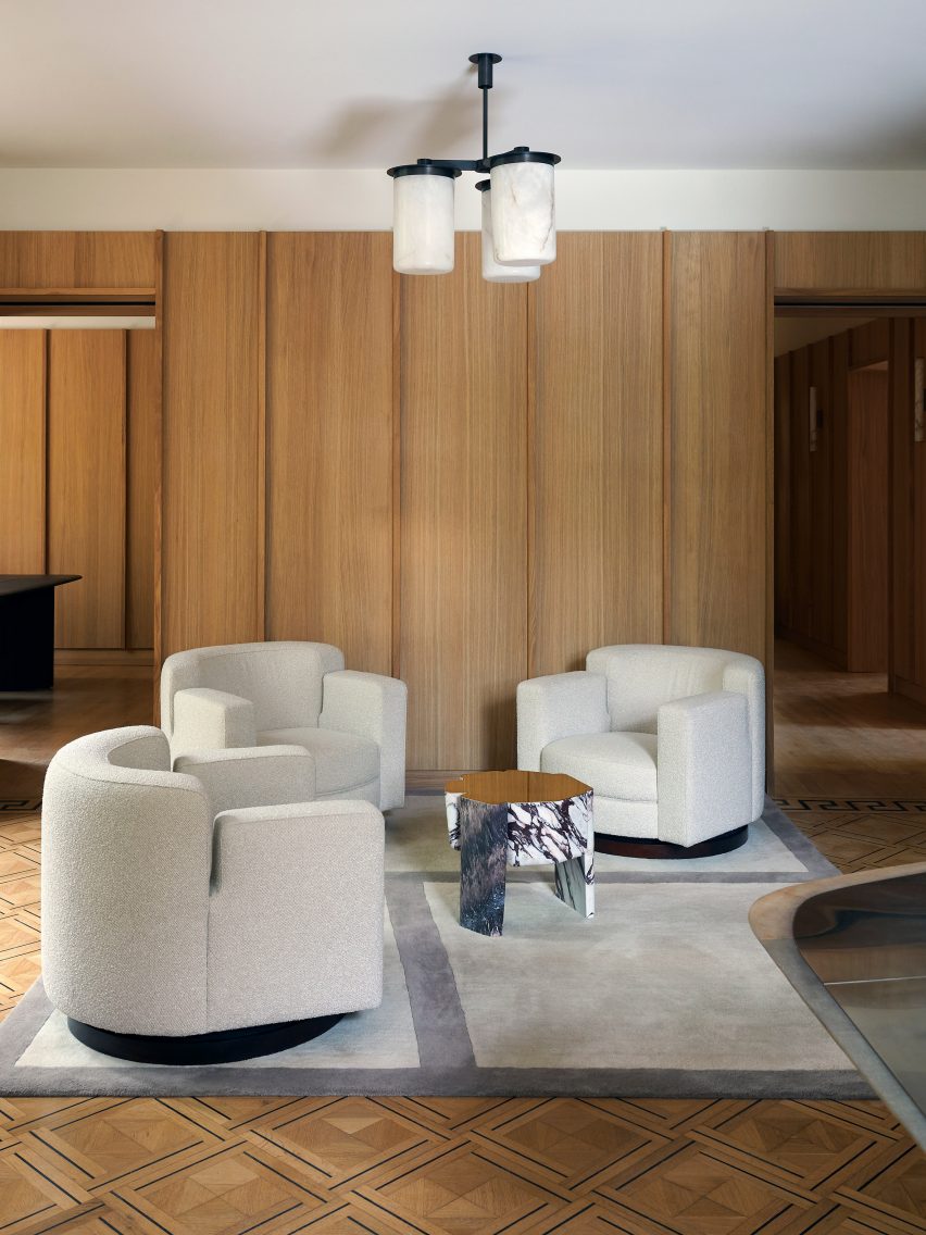
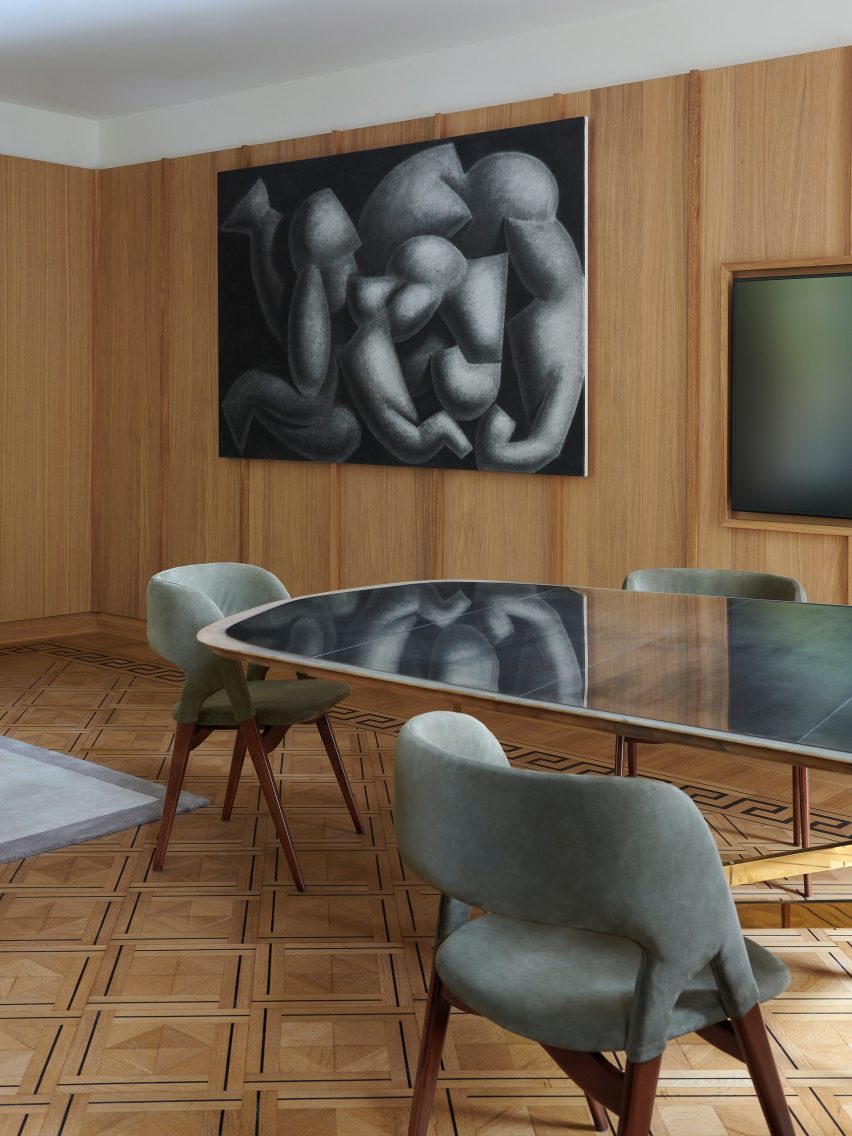
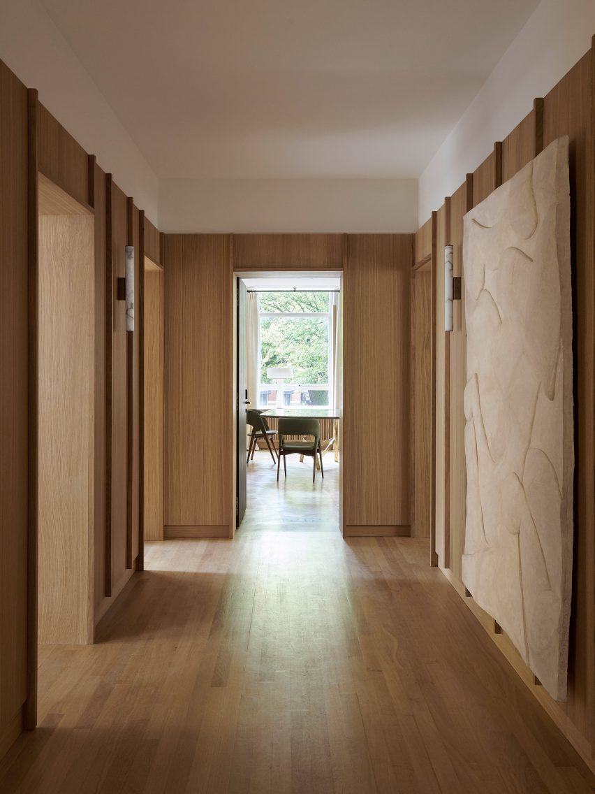
A broad range of workspaces, which are spread over two floors, were designed to encourage a collaborative culture while providing varying levels of privacy.

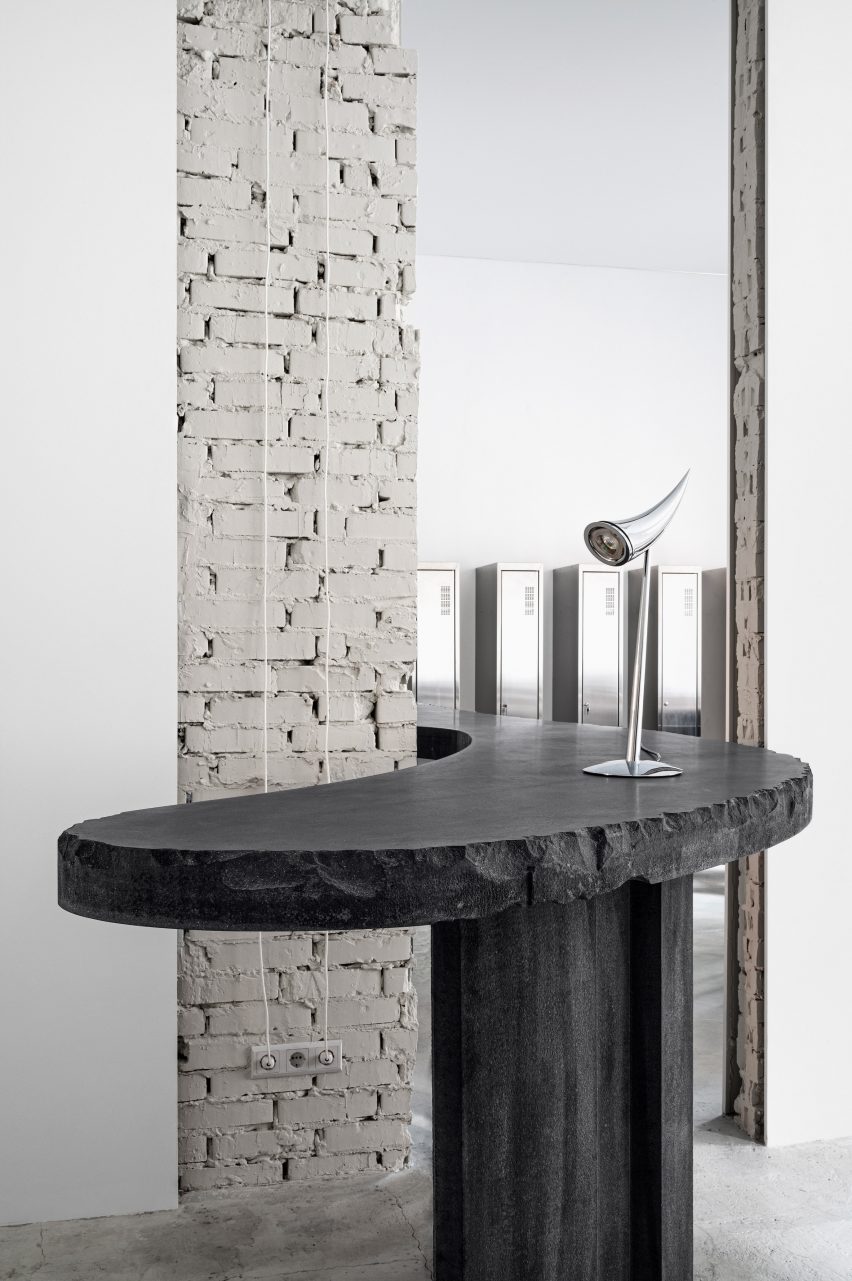
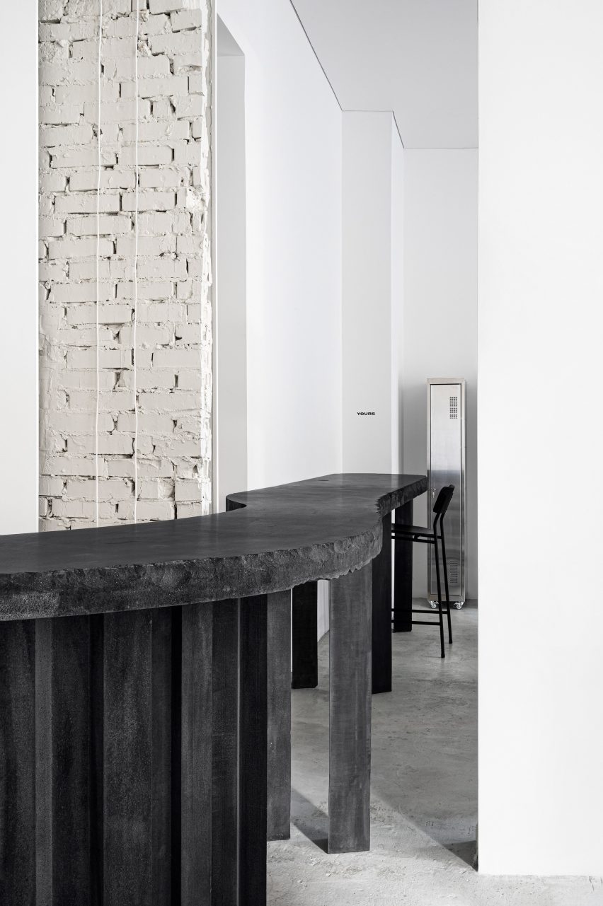
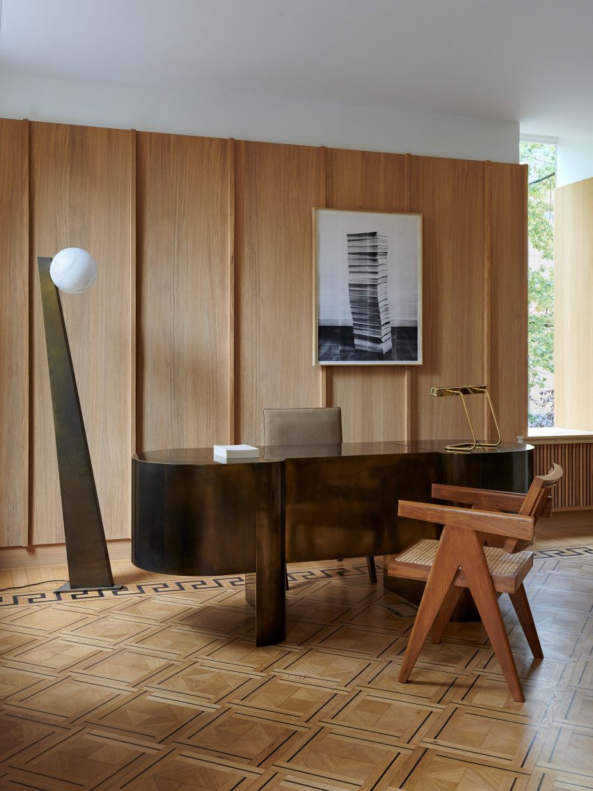
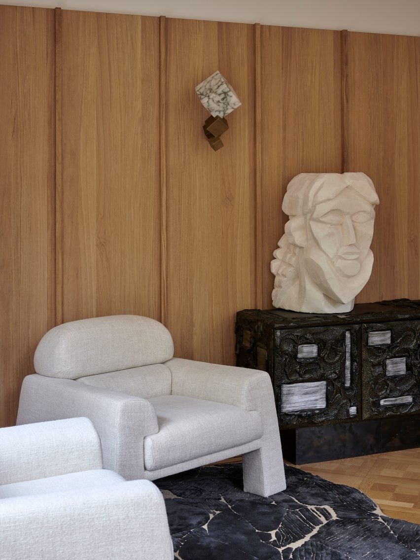
Bespoke desks, timber-lined kitchen areas and breakouts rooms designed to resemble private members clubs evoke a relaxed and homely atmosphere.

On the first floor, in the heart of the building, a mixture of secluded and open-plan working areas sit next to communal spaces such as the cinema room and social club.

A terrace wraps one the side of the building, providing relaxed outdoor spaces.

Blue and salmon furnishings pictured in a dark painted room
A breakout space features on the first floor

The interior also features movable walls that allow for meeting rooms to be expanded or reconfigured for different needs.

“Working during the pandemic and realising the impact it has had on the creative industries, it has really heightened the importance of the office and the pivotal role it plays in social working dynamics and the creation of powerful work,” Tala Fustok explained.

A dark corridor with mirrored walls and blue furnishings
Rooms were designed to create the feeling of being in a members club

Dezeen recently explored the post-pandemic needs of office workers in a live talk with architecture firm J Mayer H and office design brand Steelcase.

The panel discussion explored how the pandemic has revealed a need for better-designed office spaces and how flexible building geometry can allow office spaces to be adapted in response to Covid-19.

Photography is by Gilbert McCarragher.

source: dezeen.com

Laura Owens covers Vincent Van Gogh exhibition in colourful handmade painted wallpaper

American artist Laura Owens has covered the walls of an exhibition of Vincent van Gogh’s works in colourful handmade wallpaper.

Currently on show at Fondation Vincent van Gogh Arles, the exhibition Laura Owens and Vincent Van Gogh explores the relationship between the seminal artist and the contemporary painter.

Laura Owens and Vincent van Gogh exhibition interior
The exhibition is located at the Fondation Vincent van Gogh Arles

Seven of Van Gogh’s paintings, which have been loaned from museums and galleries around the world, are exhibited on walls covered in Owens’ distinctive wallpaper.

A selection of Owen’s own artworks are also on show.

To make the wallpaper, the American artist used pastels and watercolours to paint colourful patterns onto a giant sheet of handmade wallpaper.

Owens also employed a variety of other artistic techniques such as screenprinting, felt-flocking, black sand, oil woodblock printing, airbrushing to create the expansive painting.

Green wallpaper at the Laura Owens and Vincent van Gogh exhibition
Seven paintings by Vincent van Gogh’s are displayed in the gallery

“Parts of the wallpaper have over fifty layers of silk-screening; some of the paints include iridescent pigments whose colours shift under different lights,” said Owens.

“The wall becomes an intoxicating, refreshing means of conquering the space of an exhibition and charting surprising new mental territory.”

A Vincent van Gogh painting hanging on a colourful wall
The wallpaper was created using pastels and watercolours, among other techniques

The resulting design is almost tactile, and features lots of geometric shapes, swirling patterns and elements of nature such as flowers, shells and trees.

At the same time, the wallpaper is meant to recall the decadent, silk-covered walls found in historical chambers of palaces and castles.

Owens drew on the work of van Gogh as well as the English artist and designer Winifred How to inform the wallpaper design.

For the exhibition, she conducted detailed research into the provenance of each of the Van Gogh paintings on show. She also spent most of 2020 living in and around Arles, where she was able to research the history of the city and Van Gogh’s experience there.

Pink and blue wallpaper on the walls of Fondation Vincent van Gogh Arles
Owens drew on the densely populated paintings from Van Gogh’s later work

According to Owens, the juxtaposition between the two artists’ works “creates an environment suspended between the pre-modern and the contemporary”.

“The spaces on this level evoke not just the wallpapered interiors that Van Gogh knew from his time in Arles, but equally the world of scanners, Photoshop and digital printing,” she said.

Blue and green wallpaper with geometric patterns
The exhibition makes manifest the relationship between the two artists

Other exhibitions that make use of strong set design include Fashion from Nature by Studio 10. The Chinese design firm used translucent materials and winding ramps to create a series of abstract spaces to display artefacts.

OMA’s New York office created a site-specific backdrop for the House of Dior exhibition Dior: From Paris to the World. Each section of the exhibition space was designed to reflect the garments on display there.

source: dezeen.com

Projects Office designs non-institutional interior for mental health facility in Edinburgh

London studio Projects Office has used seaside-inspired colours and imagery to create a comfortable but practical interior for a mental health unit at the Royal Hospital for Children and Young People in Edinburgh.

The Child and Adolescent Mental Health Service (CAMHS) facility is designed to feel non-institutional, so as to make patients feel at ease, but to also look distinctly different than a domestic environment.

Orange lighthouse interior at CAMHS Edinburgh mental health unit by Projects Office
The CAMHS facility is designed to make patients feel at ease

The Projects Office team – led by architects Bethan Kay, James Christian and Megan Charnley – collaborated with art consultancy Ginkgo Projects on the interior, envisioning it as “a third space which is neither hospital nor home”, but instead has its own identity.

They developed this approach following a series of workshops and interviews with young patients, their parents and staff members.

These sessions, carried out with help from artist James Leadbitter, helped the architects understand many of the subtle details that can make a big difference to how patients feel in a space.

Lighthouse and skylight in communal lounge facilities at CAMHS Edinburgh mental health unit
The inpatient communal lounge includes a lighthouse-inspired den

For instance, the bedrooms are designed so that occupants can easily personalise them, giving them a feeling of ownership. But they can easily reverted after patients are discharged, giving a clean slate to the next resident.

“At a time of stretched NHS funding and increased demand for mental health services, we believe that good design is a powerful and cost-effective healing tool,” said James Christian.

“We also believe that asking patients, staff and parents what they really need and want from healthcare spaces leads to richer, more useful spaces.”

Quiet zone in communal lounge at CAMHS Edinburgh mental health unit
Colours and patterns take inspiration from the seaside

The mental health unit includes outpatient facilities for five to 18 year-olds and an inpatient unit for 12 to 18 year-olds.

The designers found that the seaside was often mentioned as an environment that helps to improve mental health, which is why Projects Office used this as the starting point for the design. Colours, patterns and motifs incorporate various seaside references.

Banquettes in dining room at CAMHS Edinburgh
Banquettes in the dining room extend up to the ceiling to create more privacy

“We took a playful approach to our designs for the artworks, whilst taking care to avoid the sometimes patronising wall graphics that can appear in children’s hospitals,” Christian told Dezeen.

“Each graphic intervention reinforces the overall coastal theme, but a varied approach has been taken to how they manifest in the different spaces,” he explained.

“This ranges from simple maritime pennants that spell out the name of the unit in a TV room all the way to a large lighthouse mural with a goal and targets, for ball games in the central garden.”

Seating nooks in communal areas at CAMHS Edinburgh
Seating nooks are integrated into the walls in several rooms

For the communal areas, a key challenge was to offer a sense of safety and privacy to all patients, particularly those suffering severe distress, without creating blind corners.

The designers tackled this with upholstered seating nooks built into the walls, banquettes that extend up to the ceiling, and a lighthouse-inspired den.

Bedroom at CAMHS Edinburgh
Bedrooms include a window seat with a moveable ottoman

“A spectrum of levels of privacy and togetherness is utilised to create zones that range from communal activity and convivial conversation through to nooks and corners that offer the opportunity for private conversation and to retreat without feeling isolated from others,” said Christian.

All of this was achieved on a tight budget thanks to the use of standard and off-the-shelf elements. Standard hospital furniture was simply customised, while bespoke furniture elements were built from simple plywood.

Bedroom desk and shelving at CAMHS Edinburgh
Shelves and wall boards allow patients to personalise the space

A similar approach features in the bedrooms, although these spaces have a softer and more relaxed feel.

Playful shelving and large wall boards make is easy for patients to display their personal belongings, while a window seat integrates a movable ottoman, creating a variety of different ways for families to sit together.

Both details help to make the rooms feel less like a hospital.

Lighthouse mural at CAMHS Edinburgh
A lighthouse mural in the garden courtyard creates opportunities for play

The project was funded by Edinburgh Children’s Hospital Charity. The charity’s CEO, Roslyn Neely, said the results have exceeded expectations.

“Coming to CAMHS can be a very stressful time for children, young people and their families so it was important to ensure that, from the moment they arrive, they know they are in a safe place where they will be supported and valued,” she said.

“Ginkgo and Projects Office have gone above and beyond to make sure children and young people were involved in the design and have transformed the space from bare and clinical to bright, welcoming and suitable for children and young people experiencing mental health difficulties.”

Photography is by French + Tye.

source: dezeen.com

Balbek Bureau slashes through walls in understated Kyiv tattoo parlour

Balbek Bureau has translated the minimalist artistic style of Kyiv tattoo parlour 6:19 Studio into a sparse and desaturated interior.

Located on the ground floor of a residential building in the city’s historic Podil neighbourhood, the 111-square-metre studio belongs to Ukrainian artist Ulyana Nesheva.

Black leather tattoo bed in front of round opening in 6:19 Studio
A circular opening offers views from the reception (top image) into the main studio (above)

“The concept of the studio is that all our artists, despite the diversity of their styles and colours, are united by an exploration of minimalism,” she explained.

“Simplicity is the ultimate goal and the highest form of complexity.”

Beige sofa with concrete plinth tables and statue of a boy in tattoo parlour by Balbek Bureau
6:19 Studio’s waiting area is flanked by a statue by Ukrainian artist Сhristina Ridzel

Local studio Balbek Bureau translated this idea into an uncluttered, open-plan layout using a monochrome palette of black and white paired with concrete and stainless steel.

“The goal was to design a tattoo parlour that resembles a contemporary art workshop,” the practice said.

Curved concrete table with chrome light in 6:19 Studio
Strategic openings reveal the structure of the walls and allow a long table to snake through the interior

There are almost no doors in 6:19 Studio. Instead, round and rectangular openings are cut into the walls to blend the parlour’s separate spaces.

These openings help to improve sightlines and air circulation, while revealing the construction of some of the walls.

Black concrete table with high chair in tattoo parlour by Balbek Bureau
The table acts as both a front desk and a work surface for the tattoo artists

“During construction work, we opened up the walls to see what they are made of and found that all the interior partitions are made of brick and foam, and the top is lined with plasterboard,” Balbek Bureau said.

“We liked the idea of showing this multi-layered wall and it was implemented spontaneously during construction.”

The studio’s lobby is home to a waiting area alongside a row of clothes hangers, suspended from the ceiling using metal cables, that display the parlour’s own line of branded clothing.

An 800-pound graphite-coloured concrete table snakes through the reception and into a lounge area, serving as both a front desk and a work surface for the studio’s resident artists.

“Its edge has been beaten down by hand, giving it a unique and enchanting power as a tattoo on the human body,” Balbek Bureau explained.

Black leather tattoo bed with black floor light in front of round opening in 6:19 Studio
Rows of black leather tattoo beds are lined up in the main studio

A large circular opening behind the reception provides a view of the main studio hall, where rows of simple black leather tattoo beds are arranged along both sides.

Connected to the studio space through a series of tall rectangular openings, the lounge area is used by the studio’s seven resident artists to rest.

S34 chairs by Mart Stam with cylindrical chrome coffee table and lockers in tattoo parlour by Balbek Bureau
The lounge area features vintage S34 chairs by Mart Stam alongside a low coffee table

As well as the graphite table that extends into the room from the lobby, furnishings include vintage S34 cantilever chairs by Bauhaus architect Mart Stam set around a metal table, as well as a series of matching lockers for the artists to store their belongings.

A black cube structure placed between two walls in the studio houses a hidden wardrobe, a bathroom and a dressing room for artists and customers.

Black leather tattoo beds and mirrored partition in 6:19 Studio
The studio’s strategic openings allow light to funnel into the main studio

6:19 Studio is nominated for leisure and wellness interior of the year at the 2021 Dezeen Awards alongside a refurbished Japanese bathhouse and an “otherworldly” skin clinic.

Other spaces in the Ukrainian capital completed by Balbek Bureau include a salon-cum-cocktail bar with concrete surfaces and gold accents and a restaurant that incorporates traditional Ukrainian forms, materials and colours.

Photography is by Yevhenii Avramenko.

source: dezeen.com

Arched glass panels suggest windows in basement canteen by SHH

London studio SHH has used ribbed glass panels in graduated sunset colours to provide a sense of the outdoors in this basement dining hall in Beijing’s central Chaoyang district.

Located on the lower ground floor of a twenty-storey building, the dining hall spans more than 1,670 square metres and is split into three distinct zones – a bright, all-day canteen, a traditional hotpot restaurant and a formal dining room.

Corrugated ombre glass walls in Jiaming Dining Hall
Arched glass partitions in ombre colours are designed to look like windows

“The architecture of the building is very precise, almost stern, with lots of white and beige,” lead SHH designer Thomas Chan told Dezeen. “What we’ve tried to create is a little bit of fun and hospitality to contrast the corporate face of the rest of the building.”

The main servery area, which operates from breakfast through to the evening, is symmetrically arranged and leads visitors in a circular route past food stalls serving up Chinese and international dishes.

Canteen by SHH with terrazzo counter seating, terracotta tiles and ombre glass
Terrazzo and terracotta help to create a sense of warmth in the main canteen

Wood panels, terrazzo and orange porcelain tiles were used to create a warm atmosphere while a mix of direct, indirect and concealed lighting creates brightness in the absence of natural light.

The arched, ribbed glass panels that line the seating areas are tinged in the warm pink ombre of dusk – an effect that is created by sandwiching a digitally printed gradient film in between two sheets of glass.

“Their playful shape is a bit like a window where windows aren’t possible and the glass catches the light and amplifies it,” Chan explained.

Jiaming Dining Hall with terrazzo floors and two seating areas
A mix of direct, indirect and concealed lighting creates brightness in the absence of natural light

A hotpot restaurant, which is used at lunchtime and in the evening as a dinner and events space, is located off the main dining hall space.

It features slatted timber walls and distinctive metal arches that cover the tables at the rear.

Hotpot restaurant by SHH with metal arches over seating areas
The hotpot restaurant features slatted timber walls and metal arches over the tables

An intimate dining space decorated in different tones of grey is located opposite the main dining area and lends itself to more formal meals or to host clients.

Here, the studio teamed low-hanging lighting with mid-century furnishings in pastel shades and bronze accents.


The room’s dark-toned walls form shallow alcoves for artwork displays while glass partitions have been introduced for more privacy between dining tables.

“The operating hours and usages also influenced the choice of colours,” said Chan. “For the main dining hall, which is used all day, we created a light and vibrant palette.”

Hotpot restaurant in Jiaming Dining Hall with terrazzo tables
Terrazzo was also used to form the top of the hotpot tables

“The private dining space, which is used for lunch and in the evening has a darker and moodier atmosphere while the hotpot restaurant is somewhere in between,” he continued.

“Then there’s the ribbed glass with its colour, which is like a perpetual dawn or perpetual dusk, depending on which space you’re in and at what time of day it is on your watch.”

Ombre glass dividers in dining hall interior by SHH
Glass partitions create privacy in the formal dining room

Other horizon-hued eateries include a Parisian burger restaurant by CUT Architectures that pays homage to California and a Hong Kong cafe where a terracotta colour scheme and semi-circular forms reference Australia’s spectacular sunsets.

Photography is courtesy of SHH.

source: dezeen.com

Tropical treehouses and clifftop villas form Mexico’s One&Only Mandarina hotel

Villas and treehouse suites peek out from the jungle-enveloped cliffs of this hotel on Mexico’s Pacific Coast, allowing guests to soak in the views from private plunge pools.

The One&Only Mandarina hotel is situated above a string of sandy coves on the Nayarit Riviera, about an hour and a half’s drive north of Puerto Vallarta.

Aerial view of One&Only Mandarina Hotel
The One&Only Mandarina Hotel is situated on the cliffs of Mexico’s Pacific Coast

Designed by Tucson-based Rick Joy Architects and executed by a team of local designers and craftspeople, the complex comprises a collection of communal facilities surrounded by 105 standalone suites.

At the heart of the hotel is an open-air outdoor living space arranged around a black swimming pool.

Treehouse suite among the rainforest foliage
Accommodation options include Treehouse suites, which are elevated 12 metres off the ground

“Reminiscent of the open porches of traditional Mexican haciendas, the outdoor living area features cosy woven settees and cradling rocking chairs made of Mexican tropical woods, such as Parota and Teak,” said the hotel operators.

Accommodation options are split between Villas and Treehouses, both of which can be booked either perched on the cliffs or nestled into the dense rainforest.

Ocean view from Treehouse suite
The highest Treehouse suites have panoramic ocean views

Treehouses are elevated 12 metres off the ground, engulfed by tropical foliage that encroaches their private outdoor decks and plunge pools.

Some have ocean views, and a select few at the highest elevation enjoy panoramic vistas of the coastline.

Treehouse suite terrace
Interiors of the Treehouse suites (top image) open onto terraces and plunge pools (this image)

Walls, floors and ceilings in the Treehouses are formed from local Cumaru wood in an attempt to connect the interiors and their surroundings.

The floor-to-ceiling glazing of the bedrooms can be fully retracted to create indoor-outdoor spaces. Open-air bathtubs are partially enclosed by wooden slats, while showers inside are tiled with dark stone.

Treehouse bathtub
Treehouse suites also feature bathtubs that are partially open to the elements

“Open structures capture natural light, filtered through the towering trees,” the hotel said. “While traditional Mexican design elements are reimagined, including pitched roofs with large overhangs, a nod to local palapas featuring modern, luxury design.”

The larger villas feature earthen walls that reference historic buildings once constructed on the site by the indigenous Cora people.

Funnel-shaped tiled roofs are lined in tropical wood and narrow to glass skylights, adding to the natural light that pours in from glazed retractable walls.

Villa with funnel-shaped ceiling
Guests can also stay in larger Villas, which have earthen walls and pitched roofs

Sheer curtains help to control glare and privacy, matching the neutral-toned furniture and accessories.

Outdoor showers, also coated with earth plaster, heighten the experience of staying in the rainforest.

Villa bathroom
The Villas have expansive bathrooms and outdoor showers

Two- and three-bedroom Villas are available for larger parties, families, or those desiring more space. Some of these have private dining rooms, cinemas, hot tubs and fire pits.

Villa One, the property’s most exclusive offering, also has its own wine cellar, spa and gym.

Villa terrace
Villas also come with private plunge pools and the option for ocean views

The One&Only Mandarina, which opened 1 November 2020, also offers several dining options for guests that are spread across its expansive site.

Beside the communal pool, the Alma restaurant has a diverse menu of “garden-to-plate” dishes, while Mexican cuisine reimagined by celebrity chef Enrique Olvera can be sampled at the cliffside Carao.

Jetty Beach Club restaurant
The hotel’s dining options include the casual Jetty Beach Club restaurant

The Treetop bar offers cocktails and light fare to be enjoyed during sunset, while down by the sand is the Jetty Beach Club, named for the semi-circular structure that arcs from the cliff into the water.

This casual restaurant serves seafood to tables and beach cabanas that all face the ocean.

Treetop bar
The Treetop bar serves cocktails to be enjoyed while watching the sunset

From Baja California to Oaxaca, Mexico’s Pacific Coast has no end of vacation resorts and boutique hotels for visitors to choose from.

Among recently completed options for design fans are El Perdido Hotel in Pescadero, Casona Sforza in Puerto Escondido, and Paradero Hotel in Todos Santos.

source: dezeen.com

Halleroed inserts sculptural travertine display plinths in Axel Arigato’s Paris store

Design studio Halleroed has used travertine podiums to display sneakers like sculptures in the Paris store of streetwear label Axel Arigato.

Located in the Marais district on Rue Vieille du Temple, the boutique stocks the brand’s full range of footwear, clothing and accessories, in addition to a curated selection of design objects.

Entrance to Axel Arigato Paris store with travertine displays
Axel Arigato’s Paris store is dotted with travertine display plinths

The store occupies two rooms divided by a freestanding wall of light-yellow travertine, which references the columns and beams found in classical architecture.

Walls and floors are finished in raw concrete while overhead, a punctured grid ceiling conceals the store’s lighting system.

A series of sculptural display plinths made from honed, bush-hammered or raw travertine stone help to create a “grandiose” entrance, designed to emulate the feeling of stepping into an art gallery.

Retail interior by Halleroed with shoes displayed on travertine blocks
A freestanding travertine wall divides the space into two

“The normal model for a sneaker brand is to cover every centimetre of the back walls in products from floor to ceiling,” Axel Arigato‘s co-founder and creative director Max Svärdh told Dezeen.

“We do the opposite by displaying our product on podiums in the centre of the room instead, like a piece of sculpture.”

Close-up of travertine stone table in Axel Arigato Paris store
The stone was hammered, honed or left raw

Travertine was also used to form a series of shelves in the rear of the store and custom chairs in the dressing room.

According to Svärdh, the stone has been a key element in all of Axel Arigato’s retail locations so far.

Mirroed steel clothes rail in retail interior by Halleroed
A mirrored steel clothes rail wraps the back of the store

“Our brand colour is a pale yellow so we were naturally drawn to the light yellow travertine,” he explained.

“We worked with different finishes to bring out its characteristics and more specifically highlight its impurities, which in itself makes it more beautiful.”

To contrast with the travertine, Halleroed wrapped an upholstered bench seat around one of the columns and introduced a chunky, stainless steel clothes rail.

This lines the store’s back wall and extends out into a courtyard filled with white gravel.

Travertine wall, mirrored clothes rail and upholstered bench in Axel Arigato Paris store
An upholstered bench is wrapped around a central column

Axel Arigato was launched in 2014 as an online store for luxury streetwear. It opened its first brick-and-mortar space in London’s Soho in 2016 and has since expanded into four standalone spaces.

“We always look to the neighbourhood and the specific building that we are in [when designing a store],” Svärdh said.

“Paris is the home of luxury and the use of rich travertine stone really embodies that. All standalone stores have a gallery-esque feeling to them with mutual design codes but offer completely unique experiences.”

White sneaker on travertine shelves in retail interior by Halleroed
The displays are designed to exhibit trainers as if they were sculptures

A large freestanding LED screen is used for displaying creative content in the Paris store.

The brand has previously worked with Halleroed – founded in 1998 by Christian and Ruxandra Halleroed – on its London, Stockholm and Copenhagen flagship stores, which all feature monochromatic colour palettes and concrete surfaces.

Photography is by Benoit Florençon.

source: dezeen.com

Schissel Montgomery Architects renovates Brooklyn flat for art gallerist

New York City-based architecture office Schissel Montgomery has completed a minimalist renovation of a three-bedroom apartment in the Park Slope neighbourhood.

Named Wendy’s, the studio decluttered the 1,300-square-foot (120-square-metres) apartment’s living spaces to create “a quiet, generous background for art and life”.

Schissel Montgomery Architects also converted one of the bedrooms facing the street into a study.

White Brooklyn apartment kitchen renovation with tiles
The kitchen uses only lower cabinets to create a sense of openness

The renovation centres around a new kitchen, which is partially open to the living and dining space. Previously, these two areas were separate.”The intervention focuses on creating connections between the shared spaces of the apartment and selectively removing materials accreted over time,” said the studio.

Brooklyn apartment living room with minimalist furniture
A key move was to declutter the apartment’s living room

A new banquette along the wall integrates storage beneath the seat while consolidating the previously separate spaces.

At the end of a corridor, the studio repurposed an existing bedroom to create a study for the owner. Furniture selections here include a table by midcentury designer Eileen Gray and a Barcelona Daybed by Ludwig Mies van der Rohe.

Since the apartment is at street level, Schissel Montgomery designed sheer fabric curtains to cover the bottom portion of the windows.

This gives residents more privacy, while still admitting light into the space.

Office with Mies van der Rohe Barcelona daybed
The new study occupies a former bedroom at the far end of the apartment

The project has a restrained palette with light wooden floors, white painted walls and selectively curated furnishings and artwork.

“The intervention focuses on creating connections between the shared spaces of the apartment and selectively removing materials accreted over time,” Schissel Montgomery explained.

Brooklyn apartment foyer with built-in closets
The entrance includes a full-height mirror and built-in storage

Custom details include a handmade concrete enclosure to protect the building’s steam pipe.

It is made of stacked, textured cylinders that resemble a classical column’s fluting motif.

Brooklyn kitchen dining table with custom pipe cover
Custom details include a concrete sleeve to cover the building’s steam pipe

Another additional at the apartment’s entrance is a floor-to-ceiling mirror that was to expand the space and brings more light to a darker area of the apartment.

“The intervention uses painted surfaces, whitewashed floors and window sheers to maximise bounced light in the space,” explained Schissel Montgomery.

Renovated Brooklyn apartment with custom classical details
The pipe enclosure nods to similar classical columns visible from within the apartment

These pipes are left exposed in many New York City apartments and can become so hot that they are hazardous to residents, in addition to being unsightly.

Schissel Montgomery was established in 2019 and is led by two graduates of Columbia University’s architecture school, Michael Schissel and Talene Montgomery.

Other apartment renovations in the Brooklyn area include a townhouse by GRT Architects that is filled with eclectic art objects and a monochrome interior renovation by local firm Arnold Studio.

Photography is by Daniel Terna.

source: dezeen.com

Matthew Giles Architects uses cranked beams to frame views through London terraced house

Matthew Giles Architects used white oak joinery and different floor levels to break up the open-plan ground floor of this redesigned and upgraded six-bedroom house in Wandsworth, London.

The Victorian terraced house belongs to a young family that wanted to create a home that was more suited to entertaining and having relatives stay over.

Matthew Giles Architects designed the project
A small rear extension was added

Originally a four-bedroom house, London practice Matthew Giles Architects was asked by the owners to add two bedrooms and a basement for services and storage.

The family wanted to enhance the connection between inside and outside, as well as improve the light flow and visual connections throughout the house.

To create extra space, the architects added a side-return and a small rear extension with a Corten steel roof, a loft extension and a basement floor. These additions increased the internal floor area from 155 square metres to 216 square metres.

Matthew Giles Architects designed the London townhouse
Light and neutral tones define the home

“With a small courtyard garden at the rear, the size of the ground floor extension was designed to strike a balance between internal space gained and loss of garden,” Giles told Dezeen.

“Although modest, the ground floor extension acts as a tool for enhanced light flow throughout the ground and basement levels. The vaulted side extension provides much-needed height to create a sense of light and space.”

Matthew Giles Architects inserted a reading nook into the ground floor
A reading nook has been created on the ground floor

The interior is finished with a neutral palette of raw materials such as timber, stone, concrete, timber and brick.

On the ground floor, at the front of the house, a new parquet flooring draws the eye through the lobby towards the light from the garden at the rear. Varying floor levels have been used to divide the narrow space into three distinct zones.

Neutral tones in the kitchen
White marble surfaces were used in the kitchen

The first is an entrance area that faces onto the street, the second serves as a reading nook with white oak joinery and railings, and the third is a sunken kitchen and dining space that looks out over the garden through full-height glass doors.

The kitchen features Douglas Fir timber cranked beams, timber cabinetry, white Carrara marble surfaces and exposed London stock brickwork that covers the sidewall.

“The kitchen acts as a point around which other activities flow,” said the studio. “The exposed beams create an enhanced light quality and sense of order when looking along the length of the house towards the garden and framing views as you move through the house.”

Polished concrete floors were installed in the kitchen and dining area and on the adjoining external terrace to help blur the boundaries between inside and outside.

The design has an intimate connection with nature
Parquet flooring adds texture to interior spaces

“The design has been executed so that in all areas there is an intimate connection with nature,” explained the architects. “Seated within the lofty, vaulted dining space the view out is framed by two in-situ cast concrete columns that are filleted to broaden the view.”

The basement houses a playroom area, a new ensuite bedroom and a utility room that is brightly lit by openings in the floor above and a capping skylight. The skylight also creates a visual connection between the playroom and the kitchen.

Matthew Giles Architects kept rooms light and bright
Neutral tones also feature upstairs

“This sectional approach adds a sense of drama,” said the practice. “The shadows drift down the brickwork wall and clouds are framed in the skylight two storeys overhead.”

The restrained colour and material palette is continued in the upstairs bedrooms and bathrooms with the addition of Tadelakt polished plaster in the bathroom.

A skylight in the basement
A skylight floods the basement with natural light

Matthew Giles founded his practice in 2020 after 12 successful years in collaboration with architect Tom Pike.

As half of Giles & Pike, he completed a number of residential projects across the capital, including a stepped glass extension to a house in Putney, the conversion of a Victorian workshop into a home and a timber-clad residence designed for a tiny plot.

Photography is by Lorenzo Zandri.


source: dezeen.com

Atelier Right Hub replaces corners with curves in cavernous Hangzhou spa

Chinese studio Atelier Right Hub created a cave-like spa in Hangzhou, China, with a network of interconnected, circular rooms and walls finished in white clay.

Located on the 13th floor of a commercial building by the Qiantang river in downtown Hangzhou, the Soul Realm Spa offers spaces for massage and meditation.

The interior of the Soul Realm Spa has a neutral palette
Curved walls lead visitors through the Soul Realm Spa

Local studio Atelier Right Hub was invited to create a calming interior within the building’s rectangular, 220-square-metre floorplan.

This was achieved by inserting a sequence of circular treatment rooms with curved ceilings into the centre of the plan.

A blue sofa is located at the waiting area of Soul Realm Spa
A curved blue sofa faces a semi-circular window

“If we observe life carefully, we will find that straight lines are mostly found in man-made objects while natural objects are mostly curved,” the studio told Dezeen.

“Whether it is mountains or rivers and streams, they are curved and full of changes and they have more charm and vitality than straight lines.”

The sofa is sunken into the floor at Soul Realm Spa
The walls are finished in white clay

According to Atelier Right Hub, the circular plan was informed by the shape of traditional Tibetan singing bowls – a type of inverted bell used for meditation.

The walls, ceilings and floors are made from white clay and blend seamlessly together. They have a textured finish, which the studio likens to “walking barefoot on earth”.

“China used to be a country dominated by farming culture,” Atelier Right Hub explained. “Farmers mostly farmed barefoot in the fields and children often played barefoot as well.”

“These memories are both unfamiliar and longed for in modern cities. Only when you feel the earth barefoot will you let go of your defences – this is also a way we hope spa guests could enjoy real relaxation.”

A spa bed is located in the centre of a treatment room at Soul Realm Spa
Private treatment rooms have a circular design

Each massage room features a brass garment hanger and storage tray suspended from the ceiling, where clients can store their clothing and jewellery during treatments.

Curved clay walls also wrap the perimeter of the floor plan to create a curved corridor where the studio has positioned resting areas, a lobby and the foyer.

“The interior space is similar to caves,” said the studio. “The curved ceiling, streamlined walls and the visual axes that revolve around the twists and turns form a fuzzy space-time context that is difficult to synchronize with the outside.”

A glass door leads to a walk-in shower
Showers are fitted within a circular alcove

A series of large, geometric windows punctuate the corridor, including an arc-shaped window that illuminates a small resting area and reveals expansive views of the city’s downtown area.

Its form is echoed in the semi-circular sunken lounge with green banquette seating next to the window.

Walls and ceilings seamlessly blend into one
The spa was designed to have a cave-like look

Other cavernous spas around the world include the Europhia Spa by DecaArchitecture, which is carved into the base of a mountain in Greece, and a subterranean spa in Brooklyn, New York.

Photography is by Studio FF and Studio RH.

source: dezeen.com

Malvína Day Nursery was designed to ease separation anxiety in young children

No Architects has incorporated plenty of windows, places to hide and varying floor levels into this welcoming nursery in the Czech capital of Prague.

Located in the city’s Karlin district, Malvína Day Nursery is arranged across the 130-square-metre ground floor of a larger kindergarten. Previously an office space, the nursery caters to young children between nine months and two years of age.

Mustard-coloured cloak room with egg-shaped window in Malvína Day Nursery
Egg-shaped windows near the exit allow children to wave goodbye to their parents

Local firm No Architects was asked to convert the space into an environment where children would feel safe and secure while giving them the freedom to explore their interests.

“We truly believe that design informs the way people behave and develop relations, and with kids it works completely visibly,” No Architects co-founder Jakub Filip Novák told Dezeen.

“We wanted to create an atmosphere that would be helpful for children’s development and that would challenge them in a positive way.”

Different sized tables in drawing area of Prague kindergarten by No Architects
Chairs and tables of different sizes allow children play together across age groups

The nursery rooms are organised around a central space with large windows so that there are clear sightlines across the floor plan.

Bright blocks of colour were used to highlight important areas such as the kitchen counter, lockers and play areas.

Wooden blue den in Malvína Day Nursery
Hidden dens and nooks give children the freedom to explore

“The space itself was quite dark – it’s deep and there wasn’t too much daylight,” said Novák, who started No Architects together with Daniela Baráčková in 2009.

“So we chose a lot of white and light finishes, natural oiled plywood and warm colours that correspond with the nursery’s branding.”

Egg-shaped window into sleeping area of Prague kindergarten by No Architects
Another egg-shaped window allows carers to look into the sleeping area

Everything was designed to be easily visible and within reach, so day-to-day operations can be streamlined to allow the carers to spend more time with the children.

For kids who find it difficult to part from their parents, the studio installed windows near the exits where they can wave goodbye while being held up by their carers.

Dressing room with mustard yellow and navy blue lockers in Malvína Day Nursery
The cloakroom features mustard yellow and navy blue lockers

“We wanted to help the children get over separation anxiety in a positive and constructive way and help teachers to stay calm and focused,” Novák explained.

“We achieved this through a clear articulation of space and by creating a sense of playfulness in the design, including quiet corners, places to hide and different levels so that the kids can feel more in control of the environment.”

Kitchen area with plywood cladding in Prague kindergarten by No Architects
An open kitchen allows children to feel involved in the food preparation

Windows were also integrated into the sleeping and playroom areas as well as the unisex toilets, to allow kids who are old enough to safely use the bathroom with carers on hand in case assistance is needed.

A series of steps were installed in the cloakroom to raise children up to an adult’s height and prevent carers – particularly grandparents – from having to bend over to help them with their coats and shoes.

Stepped play area with nook in the wall in Malvína Day Nursery
An open-plan layout allows carers to keep an eye on the children

An open kitchen allows the children to observe the food preparation process before dining at the kitchen counter to create a more “collective experience”.

The kids can also access snacks from a lower kitchen counter if they are hungry outside of allocated meal and snack times.

Stepped seating and platforms with mats are used throughout the rooms to create varied landscapes while keeping children easily visible to the carers.

Other playful features such as slides and dens were introduced to encourage exploration.

Stepped play area with yellow matts and brown nook in Prague kindergarten by No Architects
Stepped play areas are bolstered with yellow mats

“We made hidden corners on purpose to make it more challenging and more playful,” said Nóvak. “It creates more interactions and takes longer for the children to discover the whole space.”

Desks and chairs in three different sizes enable children of all ages and heights to easily play together, while small-scale toys that encourage motor skill development are hidden around the space.

A quiet sleeping area includes a row of cots for younger children and a series of mats for the older ones.

Pendant lights in mustard yellow, oxblood red and navy blue in Prague kindergarten by No Architects
Primary-coloured pendant lights illuminate the space

In Japan, architect Takaharu Tezuka designed this Tokyo kindergarten as a continuous space complete with an oval roof deck, allowing for unfettered learning and play rather than imposing physical boundaries on the children.

Elsewhere, architecture firm BIG installed curvaceous wooden reading dens and lily pad-like cushions in the first school of co-working company WeWork.

Photography is by Studio Flusser.

Source: dezeen.com

Framework imbues Amsterdam family office with the “calm ambience of an art gallery”

Sculptural furniture and French oak panelling define this plush family office in Amsterdam, which has been renovated by local studio Framework.

Located in the centre of the city, on the second floor of an office building that dates back to 1910, the workspace belongs to a family business.

Brass desk and wood panelling in interior of Tesselschade family office
Top image: sculptural furniture and artworks were sourced by Framework in collaboration with the client. Above: a custom brass desk anchors one of the four private offices.

The 220-square-metre space consists of four private offices and a meeting room, which are blessed with generous windows and decorative wooden floors that have survived more than a century of wear.

According to Framework, the client called for an “artistic approach” to office interiors that would approximate the “calm ambience of an art gallery”.

White vintage chairs and French oak panelling in Amsterdam office by Framework
Framework sourced a trio of vintage chairs by Luciano Frigerio from 1968

In response, the studio applied oak panels to the walls to evoke a sense of cocooning warmth and sourced a careful selection of sculptural design pieces and artworks from all over the world.

Highlights include a trio of vintage armchairs created by Italian designer Luciano Frigerio in 1968, massive abstract sculptures by Antwerp-based artist Florian Tomballe and a custom brass desk procured via New York’s Patrick Parish Gallery.

White armchairs and massive abstract sculpture in Tesselschade family office
Abstract sculptures by Florian Tomballe punctuate the space

“We sourced the pieces together with the client, who is a young art collector,” Framework told Dezeen.

“We mixed Italian, French and Dutch artists in this office that are rarely seen out of their regional context. The Framework design studio is made up of multiple nationalities – that’s what makes our designs so eclectic and undefinable in style.”

Meeting room with abstract artwork and original oak floors in Amsterdam family office by Framework
The office’s original wooden floors were retained

Led by Dutch designer Thomas Geerlings, the studio has offices in Amsterdam, Paris and Ibiza.

This project marks the first collaboration between Framework’s French and Dutch offshoots.

“We worked closely together on this project to get the best result,” Framework explained.

“Because the Amsterdam studio is more focussed on Dutch artists and is working from a Dutch point of view, it always enhances the outcome to have another viewpoint on subjects like this.”

French oak panelling in Tesselschade family office
All rooms including the hallway are panelled in French oak

Framework has previously turned a neglected 19th-century warehouse in Amsterdam into a luxurious family home and designed Water Villa, a houseboat with a geometric exterior, together with Studio Prototype.

Photography is by Kasia Gatkowska.

Source: dezeen.com