Category Archives: News

Marcel Wanders draws on Dutch history for overhaul of Schiphol airport lounge

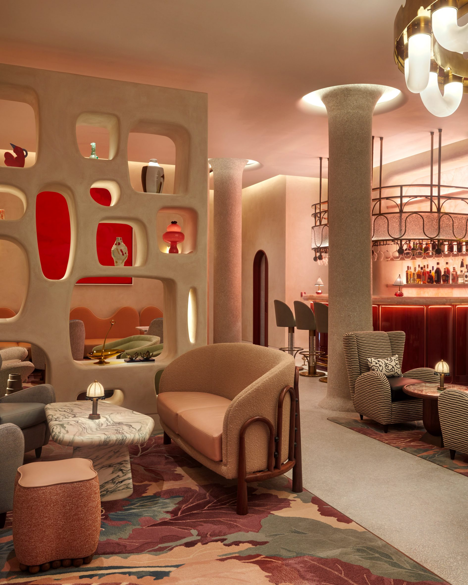
References to Dutch culture and history are woven throughout the VIP centre of Amsterdam’s Schiphol airport, which has undergone a maximalist revamp by designer Marcel Wanders.

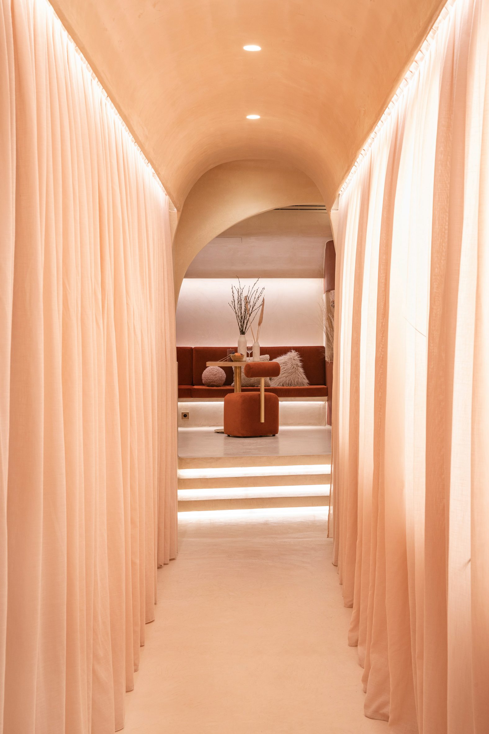
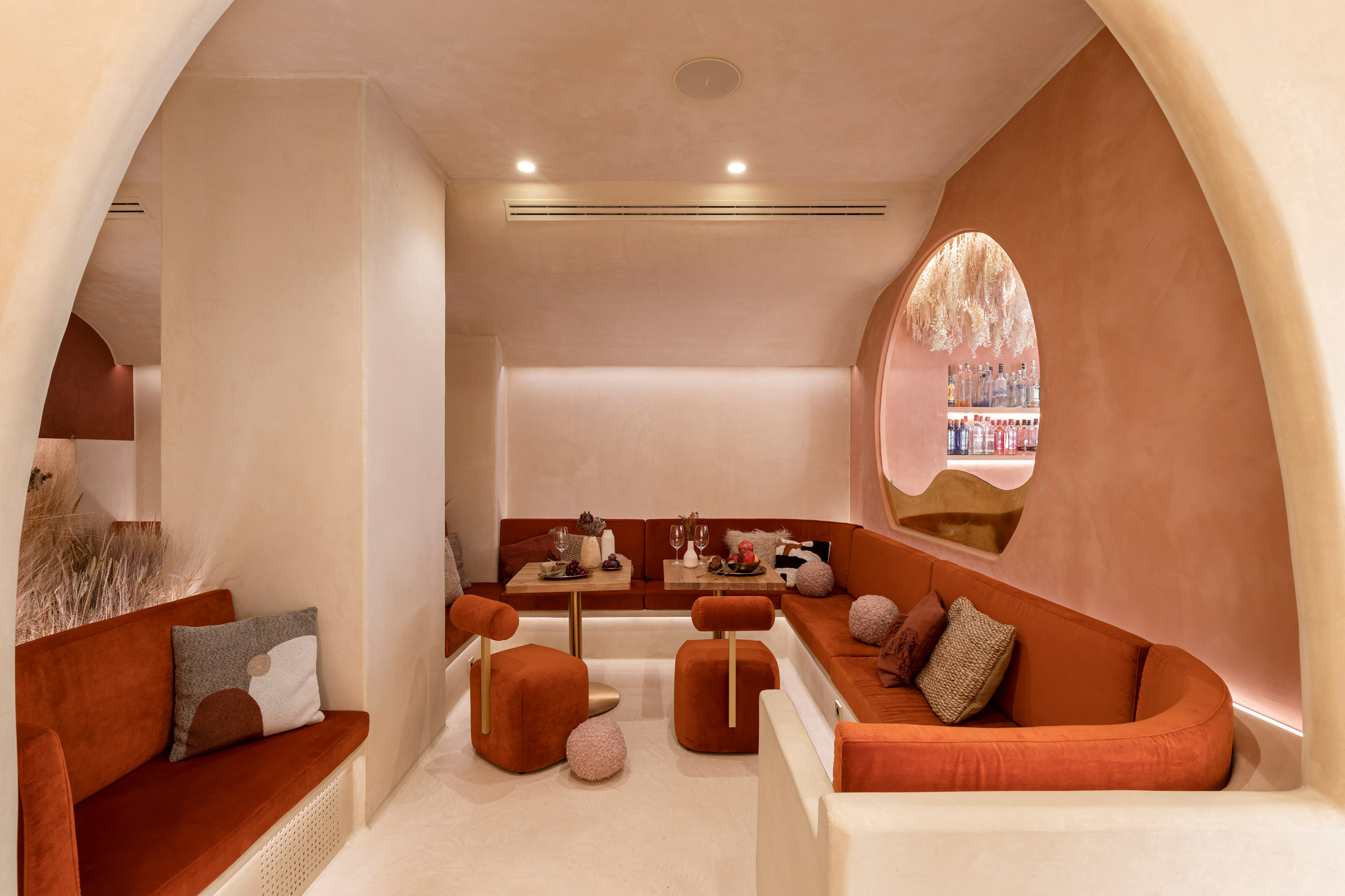
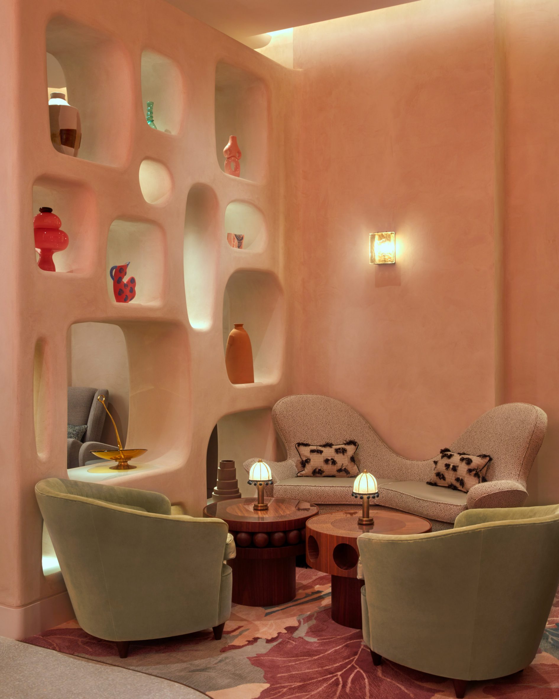
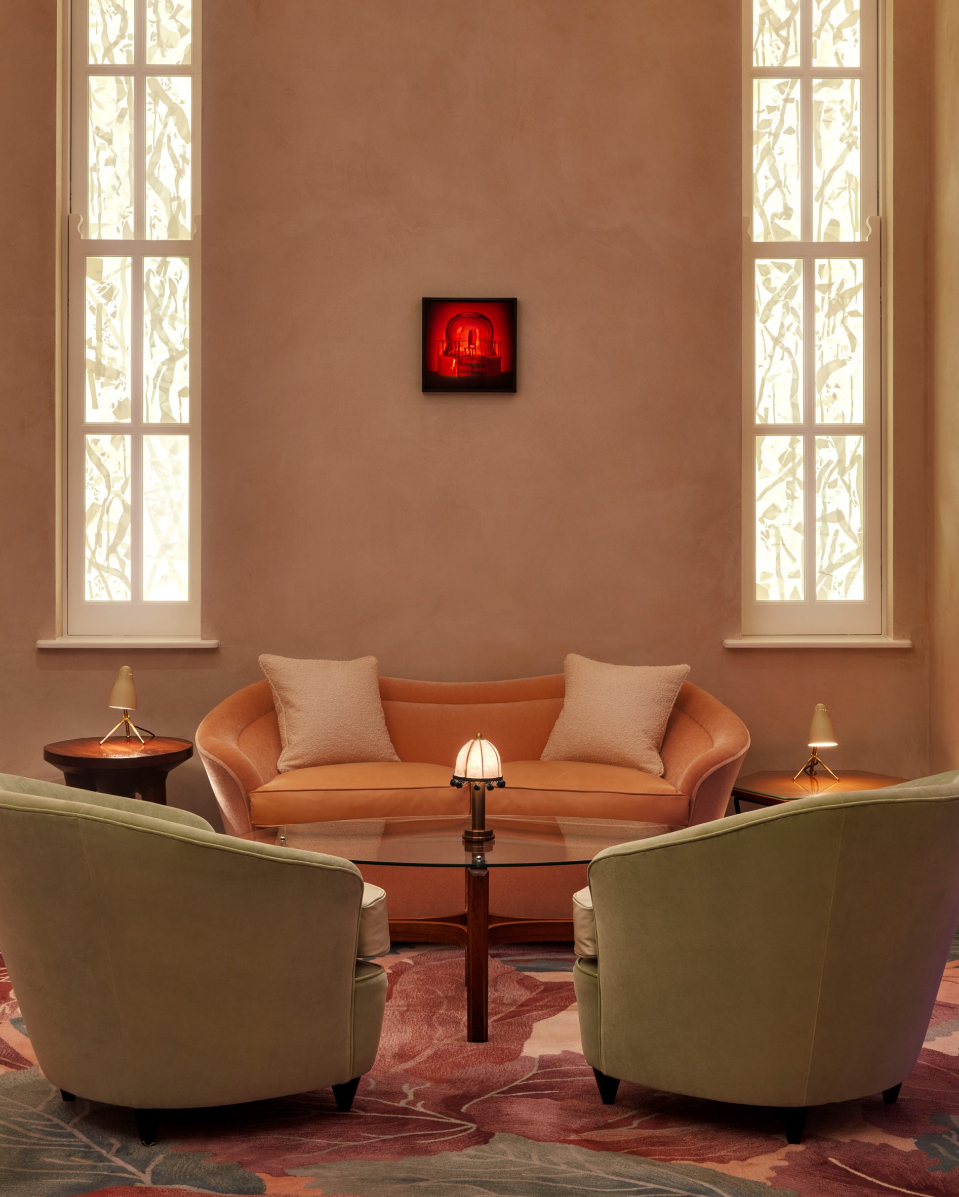
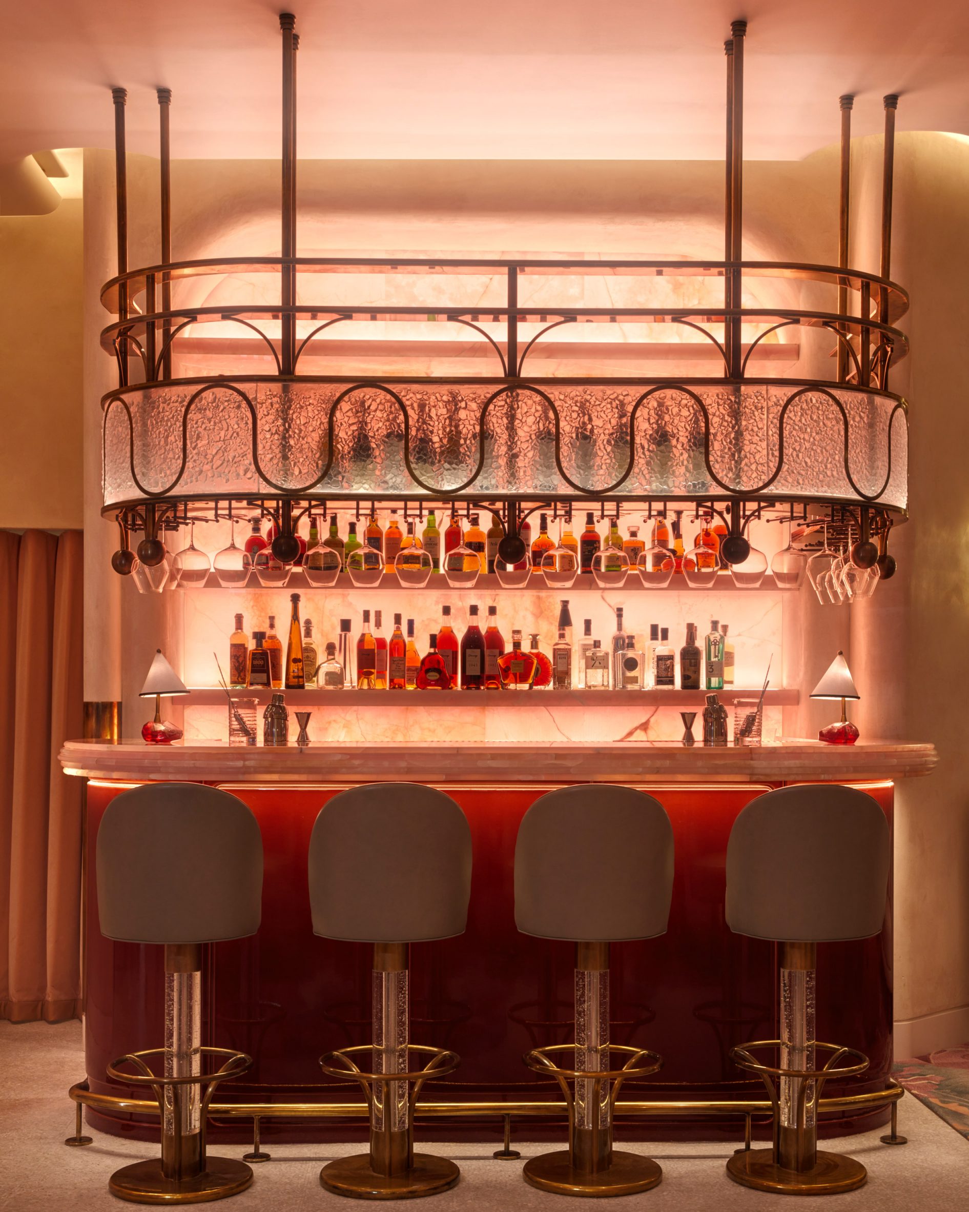
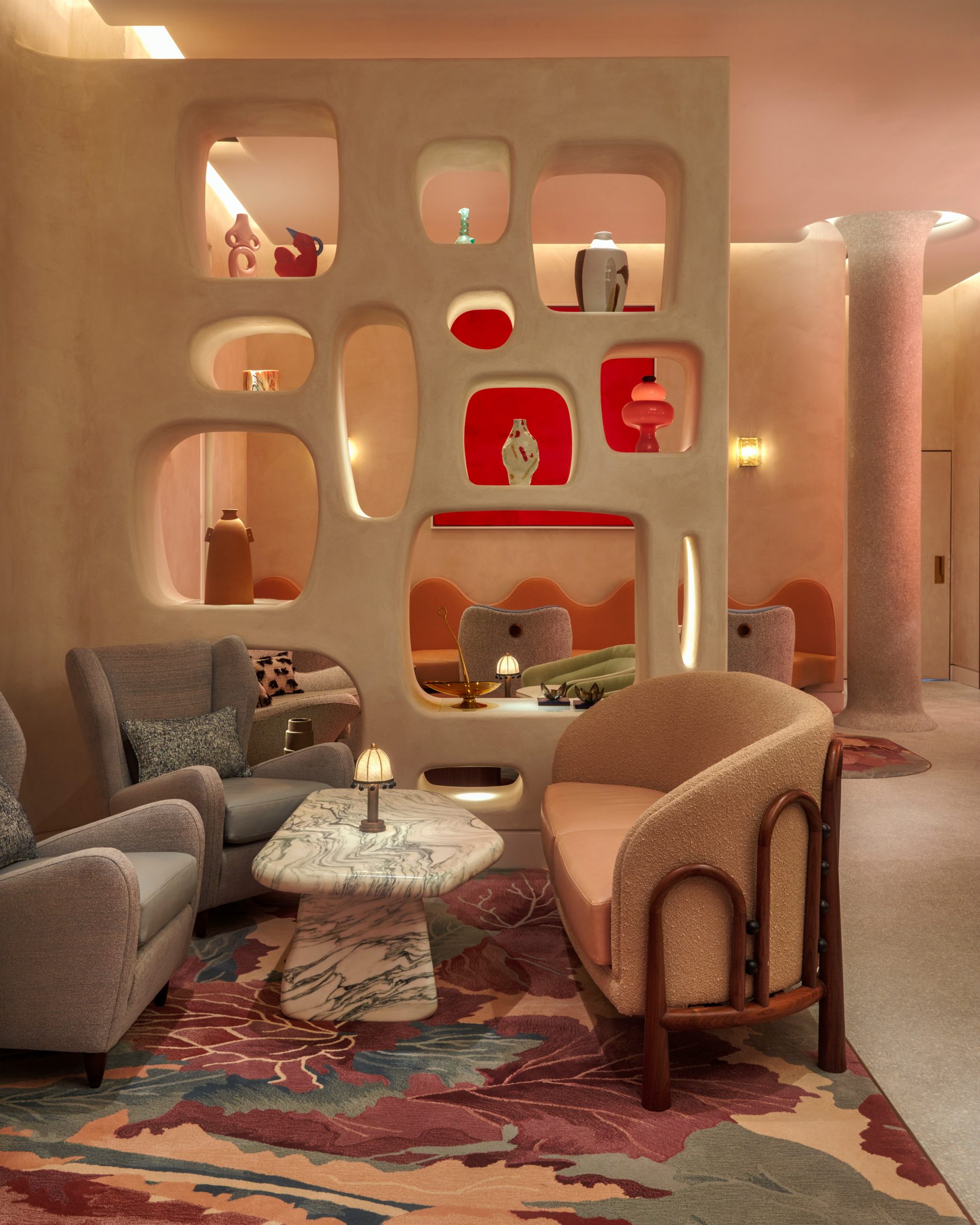
The airport lounge comprises a sequence of rooms including a library, drinks bar and smoking room, all designed by Marcel Wanders and his studio to have a distinct theme.

“We wanted each room to be able to exist on its own,” explained Gabriele Chiave, the studio’s creative director.

Red armchair next to book stand in Schiphol VIP centre
Replicas of famous Dutch paintings are displayed in Schiphol’s VIP centre

“Of course, the main thread throughout is Dutch heritage and culture,” he continued. “But we decided on main themes like art and innovation that inspired generations of designers.”

“This travellers’ lounge offered an opportunity to share Dutch culture with the world,” Wanders added. “It introduces people to our history and our masterpieces.”

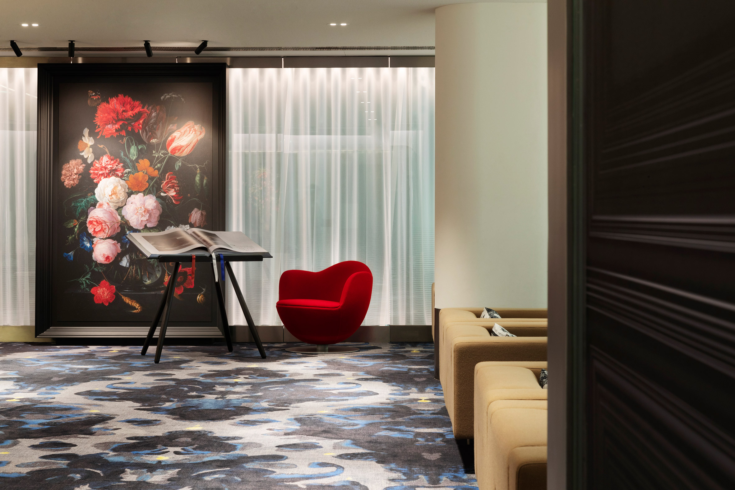
As travellers enter the VIP centre, they come into a relaxed lounge area designed to loosely resemble the national Rijksmuseum in Amsterdam.

Brown armchairs in front of white and yellow painted wall with Dutch master replicas in airport lounge designed by Marcel Wanders
The workroom features trompe l’oeil walls

Displayed on the walls are replicas of paintings by different Dutch masters, set against backlit glass walls that were installed a decade ago during the last renovation of the lounge by local practice Concrete Architects.

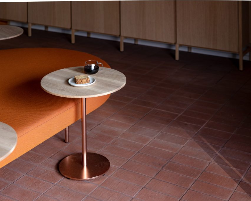
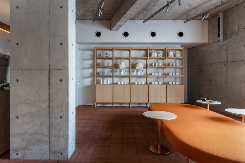
Across the room are banks of coffee-coloured sofas, which like the rest of the furnishings throughout the centre were selected in collaboration with Dutch design brand Lensvelt.

Blue-and-white room in airport lounge designed by Marcel Wanders
One of the seating areas was designed as a celebration of Delft Blue pottery

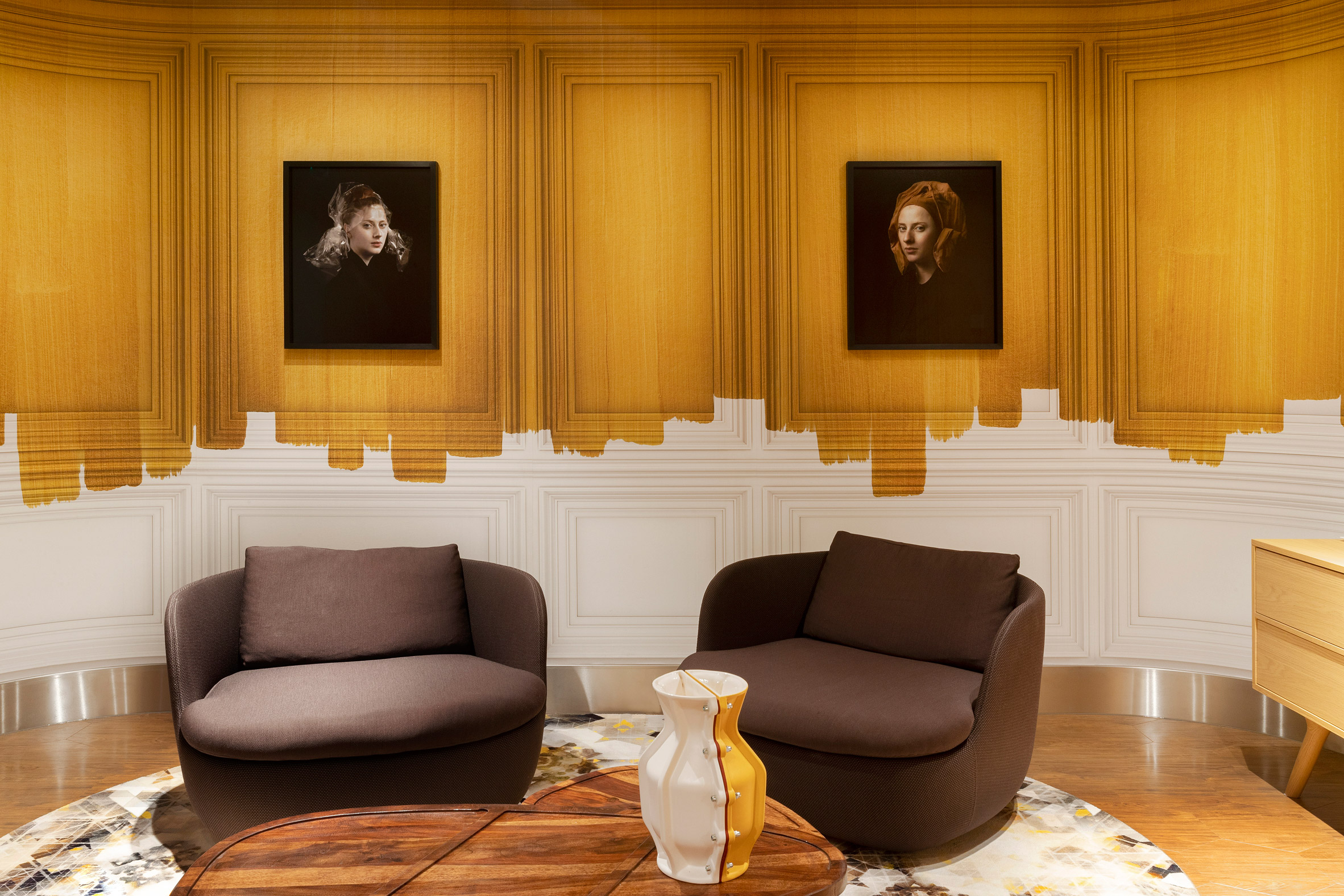
More reproductions of significant Dutch artworks are found in the centre’s workroom, where travellers can sit down with their laptops or take private phone calls.

Here, a trompe l’oeil effect on the walls creates the impression that the room is finished with traditional boiserie, half-varnished in a rich yellow ochre hue.

Another lounge area showcases digital portraits of famous Dutch cultural figures – both real and fictional – including artist Vincent Van Gogh, violinist Andre Rieu and cartoon bunny Miffy.

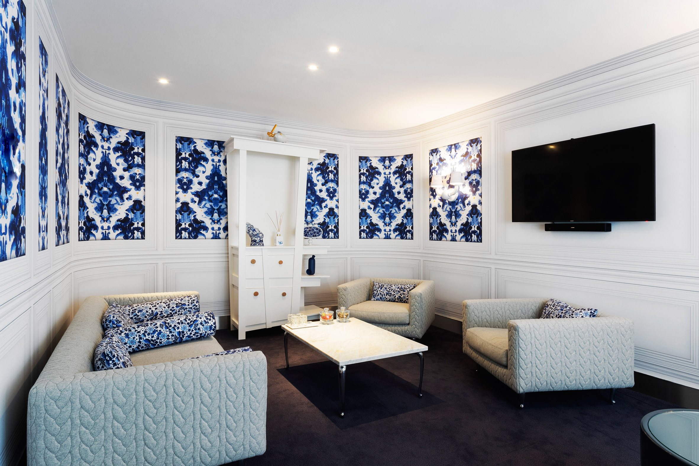
Guests can also retreat to the VIP centre’s Delft Blue Salon, which takes its name from a style of Dutch tin-glazed pottery that’s typically adorned with intricate blue-and-white designs.

Living up to its name, the room was fitted with patterned blue wallpaper panels and dotted with a few Delft Blue vases.

Smoking room of Schiphol VIP centre with brown leather armchairs
The smoking room hints at the Netherlands’ connection to the tobacco trade

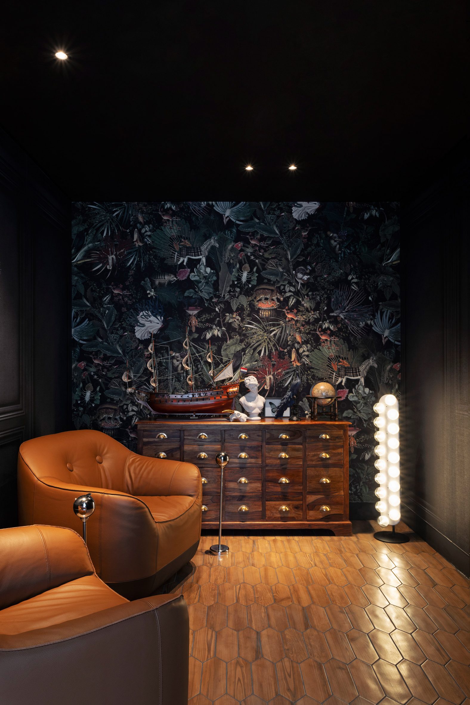
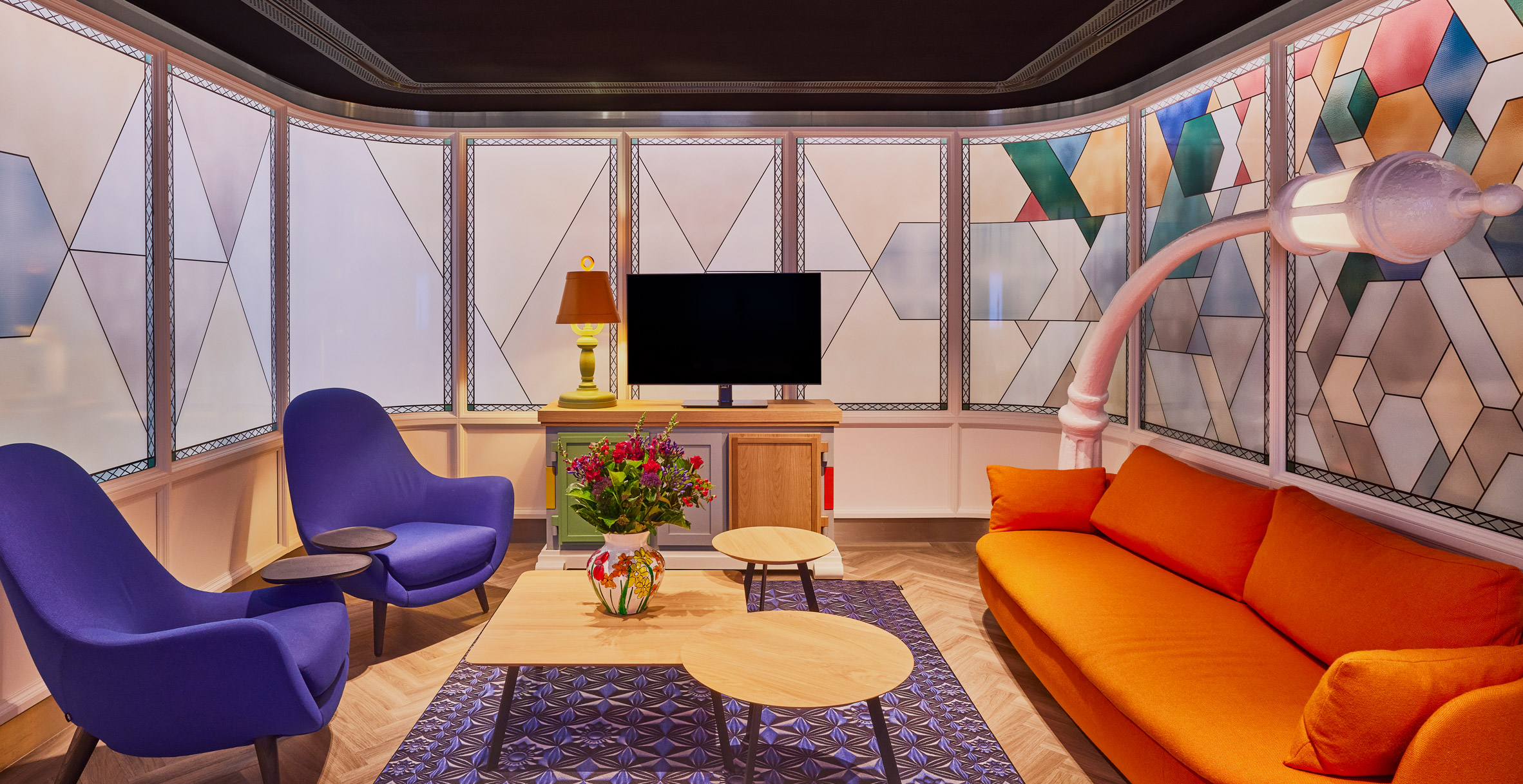
Elsewhere in the VIP centre, there’s a smoking room that nods to the Netherlands’ historical ties to the tobacco trade and a seating area designed to reference Amsterdam’s canal houses, with a streetlamp-style light and fake stained-glass windows.

Other amenities include a library, drinks bar, games room and a serene sleeping room.

Lounge area of airport lounge designed by Marcel Wanders with orange and purple seating and fake stained glass windows
Amsterdam’s canal houses informed the look of this lounge

Wanders is known for his striking maximalist aesthetic, which can also be seen in his interior design for Doha’s Mandarin hotel with its mismatched patterns and oversized furnishings.

Stateside, the designer has previously created a diamond-patterned facade for the Louis Vuitton store in Miami, referencing the brand’s iconic monogram logo.

source: dezeen.com

Vipp sets up one-room hotel inside ex-pencil factory in Copenhagen

A factory that once made Denmark’s classic Viking school pencils now contains a one-room hotel conceived by homeware brand Vipp.

The 90-square-metre hotel – which is aptly called Vipp Pencil Case – is situated on the factory’s ground floor and accessed via a sun-dappled courtyard.

Kitchen interior of Vipp Pencil Case hotel in Copenhagen
The hotel room is arranged around an open living and dining area

This is one of six hospitality spaces that Vipp has established for design-conscious travellers – others include Vipp Shelter, a pre-fab cabin nestled along the shores of Lake Immeln in Sweden, and Vipp Farmhouse, an 18th-century dwelling located in a rural pocket of Denmark’s Lolland island.

The interiors of Vipp Pencil Case is the work of Danish designer Julie Cloos Mølsgaard, who spent a year curating a neutral yet warm space that she felt sat comfortably within the industrial setting.

Kitchen interior of Vipp Pencil Case hotel in Copenhagen
Guests can gather around a large oak and stone dining table

At the heart of the hotel room is a light-filled living and dining area. To one side lies a powder-grey edition of Vipp’s V1 kitchen suite, where guests are invited to rustle up their own meals.

To the other side of the space is a large oak dining table with a Jura stone countertop, and a number of storage cabinets that hold extra crockery and cookware.

Bedroom interior of Vipp Pencil Case hotel in Copenhagen
The bedroom lies behind sliding doors

Woven baskets, ceramic vases and contemporary artworks have been dotted throughout as decoration.

“Vipp Pencil Case is not your average hotel room – more like a studio or atelier, it elicits an artistic ambience and holds a rare quietude in the heart of the Danish capital”, explained Mølsgaard.

Bedroom interior of Vipp Pencil Case hotel in Copenhagen
Paintings on the walls give the hotel an artsy studio feel

A set of tall sliding doors can be pushed back to reveal the bedroom, which has been dressed with a couple of marble-topped side tables and a plump white seating pouf.

Light streaming through the building’s expansive crittal-style windows is dampened by floor-to-ceiling Kvadrat curtains.

The wooden floorboards that feature here and throughout the rest of the hotel room are meant to nod to the materiality of Viking pencils, and the fact that the building also once served as a showroom for wooden flooring brand Dinesen.

The room also includes a sleek shower room that’s been almost entirely clad with jet-black tiles.

Bathroom interior of Vipp Pencil Case hotel in Copenhagen
A bathroom is clad in jet-black tiles

Viking’s former factory is located across the water from central Copenhagen on Island Brygge. This is not Vipp’s first intervention on site – late last year, the brand transformed another part of the factory into a supper club where chefs from around the world can host intimate dining experiences.

Its interiors were also designed by Mølsgaard, who filled the space with wooden furnishings and tactile rugs and cushions.

The photography is by Rasmus Hjortshøj.

source: dezeen.com

RCKa designs Nourish Hub to tackle food poverty in London

Architecture studio RCKa has transformed a row of vacant shop units in west London into a community kitchen and learning space that hopes to reduce dependency on food banks.

Located on the Edward Wood Estate in Hammersmith, Nourish Hub provides the first permanent home for UKHarvest, a charity that uses food as a tool for social impact.

Nourish Hub by RCKa
Nourish Hub is designed to feel open and accessible

With Hammersmith & Fulham the London borough with the highest dependency on food banks, Nourish Hub’s ambition is not only to provide food for vulnerable local residents. It offer opportunities for people to practice cooking skills, learn about nutrition and access jobs in the food industry.

The space includes a commercial kitchen, a teaching kitchen and a flexible space that can be used as a dining room, workspace, classroom or event venue.

Red and yellow chairs in Nourish Hub by RCKa
A flexible interior can be used as a dining room, classroom, workspace or event venue

RCKa’s role was not only to plan the interior, but to find ways of empowering the local community to get involved in the facility and make it their own.

The design strategy focused on making the space – which previously housed a post office and a supermarket – feel as accessible as possible.

Facade of Nourish Hub by RCKa
Vibrant colours and bold signage make the space more welcoming

The facade can be opened up, thanks to sliding glass doors and a serving hatch, while bright colours and bold signage create a friendly feel throughout.

“Getting people through the door is the first challenge, so the Hub had to seem open and welcoming to the entire community,” said RCKa director Dieter Kleiner.

Serving hatch at Nourish Hub by RCKa
The facade integrates a serving hatch and large sliding doors

When developing the design, the architects decided against a traditional community engagement programme. Instead, they hosted a range of pop-up activities to attract the interest of local residents and learn about their experiences.

They started by painting a graphic mural over the old shutters. They also set up an outdoor kitchen, created playful questionnaire cards and hosted workshops with children.

“It wasn’t about co-designing the space with local people; that wasn’t what we needed,” explained project architect Anthony Staples during a press tour.

“We had three aims: to raise awareness of the project, to test ideas and to establish a local identity.”

Ceiling mural in Nourish Hub by RCKa
A ceiling mural design came out of a children’s workshop

In one children’s workshop, participants created graphic designs out of raw fruit, vegetables and grains.

One of these designs is now painted on the ceiling, while another has been turned into ceramic wall tiles.

Teaching kitchen in Nourish Hub by RCKa
The training kitchen includes wheelchair-accessible surfaces

For the interior layout, RCKa took cues from Victorian kitchens. The teaching kitchen takes the form of a large island, while open cabinets display tableware and cookbooks.

“We were really inspired by old-fashioned kitchens, which are very performative,” said Staples.

“Everything is on display, so when you go in, you feel like you want to touch and grab things.”

Kitchen counter in Nourish Hub by RCKa
Open shelving was favoured over cupboards

The space is furnished with wooden tables, and chairs in bold shades of red and yellow.

There are also various details added in to make the space accessible to a wide range of users. These include lowered surfaces that cater to wheelchair users and a curtain that supports those with specific privacy needs.

RCKa and UKHarvest workshops with children
The children’s design workshop also provided graphics for ceramic wall tiles

Yvonne Thomson, the CEO of UKHarvest, believes the concept can help to tackle issues of food poverty and insecurity, which impact an estimated 8.4 million people in the UK.

The project was realised with funding support from the Mayor of London’s Good Growth Fund, as well as the borough, but the target is for Nourish Hub to become financially self-sufficient within three years.

“Great care has been taken to create a versatile space that enables us to facilitate positive change and meet the needs of different community groups,” Thomson said.

RCKa and UKHarvest community engagement
The architects began the community engagement process by painting the old shutters

RCKa compares the project with its previous work on The Granville, a community centre with the purpose of providing accessible workspace for local startups.

Staples believes these types of projects could easily be replicated across the UK, to bring change at a large scale.

“This project is totally replicable,” he said. “We could roll them out in a lot of London boroughs and beyond.”

Photography is by Francisco Ibáñez Hantke.

source: dezeen.com

Oku restaurant in Mexico City features “floating tables” made of wood and steel

Curved booths are suspended over a dining room at a Japanese restaurant in Mexico City designed by local firms Michan Architecture and Escala Arquitectos.

The sushi eatery is located in the upscale neighbourhood of Jardines del Pedregal, across from a famed church known as Parroquia de la Santa Cruz del Pedregal.

Oku restaurant
Oku is a sushi restaurant in Mexico City

It is the second Oku restaurant designed by Michan Architecture. The other – which features a cave-like ceiling made of huge concrete lights – is found in the district of Lomas de Chapultepec.

For the Pedregal location, the architects worked with another local firm, Escala Arquitectos. The team aimed to elongate the space’s proportions and take advantage of its height.

Restaurant by Michan Architecture
The restaurant is Michan Architecture’s second of its kind

Rectangular in plan, the eatery has two levels. The lower level encompasses a sushi bar, indoor and outdoor seating, and a back-of-house zone.

Additional seating is found upstairs, where a series of “floating tables” are arrayed along a corridor.

Floating tables
“Floating tables” are arrayed along a corridor

“The mezzanine level features individual tables hung from the existing structure, giving guests a unique dining experience,” the studio said.

Two of the tables hover above the sushi bar, and two extend over the outdoor terrace. Each has wooden walls that enclose a single booth.

Curved staircase
Curved stairs connect Oku’s two levels

A similar enclosure was used for the stairs connecting the restaurant’s two levels.

The dining pods are supported by light steel members that are welded into the building’s existing steel structure.

Above the mezzanine is a drop ceiling with curved cutouts that expose the steel framing and add height to the space.

Moreover, the openings provide a “sensation of cutting and pasting the ceiling onto the tables”, the architects said.

Black lighting fixtures
Cylindrical black lighting fixtures hang from the ceiling

Hung from the ceiling are cylindrical, black lighting fixtures, which merge electrical cables with structural elements.

Throughout the restaurant, the team used neutral colours and clad surfaces in pine, pigmented stucco and panels made of glass-fibre-reinforced concrete (GFRC).

Oku pine wood restaurant
The team used neutral colours and clad surfaces in pinewood throughout Oku

The effect is a “light and open atmosphere that plays with polished and raw finishes”, the team said.

Other Japanese eateries in Mexico include Mexico City’s Tori Tori by Esrawe Studio, which features elements inspired by Samurai armour, and a restaurant by TAX Architects in the coastal town of Puerto Escondido that is topped with a thatched roof.

The photography is by Alexandra Bové.

source: dezeen.com

Masquespacio designs cavernous restaurant interior that nods to adobe architecture

Local studio Masquespacio added undulating, earthy-toned walls to an intimate Valencia restaurant that takes cues from the “organic forms” of Middle Eastern architecture.

Living Bakkali is located in the Spanish coastal city of Valencia and features bespoke furniture designed entirely by Masquespacio, a design studio known for its use of colour in projects.

Living Bakkali
Living Bakkali’s interiors are informed by Middle Eastern architecture

The restaurant is characterised by sloping, sandy-toned microcement walls that pay homage to the decorative motifs often found in Middle Eastern architecture, such as multifoil arches.

Designed in various hues of desert-like browns and pinks, Living Bakkali’s curved arches are arranged in intricate formations that create intimate seating areas within the restaurant.

Microcement walls
Masquespacio used microcement to create walls, floors and ceilings

“We used the recognisable brownish colour from the East, although we added slightly different colours to the palette – such as red – but always in a soft way and through earthy tones,” Masquespacio co-founder Christophe Penasse told Dezeen.

“Middle Eastern seating is also almost always lower and more loungy than in the western world,” he added, referring to the restaurant’s low-slung dark crimson sofas and chairs.

Central hall
A central hall intends to evoke the feeling of walking down a street

Guests enter the space at a central hall that is connected to the kitchen, which was designed to create the feeling of exploring a street filled with ancient houses.

“Interiors [in the Middle East] are almost never shown directly from the outside, although you can [often] find windows of arch forms that create a sense of double walls,” explained Penasse.

Intimate booth
Intimate booths are framed by the cavernous walls

The restaurant’s thick walls are interrupted only by cut-out holes that create small windows between each table, some of which are tucked away in intimate booths. Among the various dining areas is a private room, which is reached through a corridor flanked by gauzy curtains.

Described by the restaurant itself as an “ode to adobe architecture,” Living Bakkali takes cues from this natural construction material, as Masquespacio said that the venue’s walls were designed to create an adobe effect, which means mud-brick in Spanish.

The studio also designed all of the floors and ceilings in microcement in order to immerse visitors in a wholly cavernous environment that is intended to be reminiscent of traditional Middle Eastern houses.

Penasse said that Masquespacio’s design process for Living Bakkali involved the exploration of many aspects of Middle Eastern culture – from architecture and materials to ways of eating through history.

Private dining room by Masquespacio
A private dining room can be reached through a narrow corridor

“We got connected with the organic forms that have been used throughout Middle Eastern architecture, which was made mainly with clay materials by hand,” Penasse explained.

“We wanted to bring the [traditional] Arabic aesthetic to the future in a new and more modern way, but still sought to maintain its essence,” he said.

Low-slung seating in Masquespacio restaurant
All of the seating was designed to be low-slung

Masquespacio was founded by Penasse and Ana Milena Hernández Palacios in 2010. Similar projects by the studio include Pukkel, a restaurant in Aragon that features winding stucco walls that were informed by the curvature of the nearby Pyrenees mountains.

The photography is by Sebastian Erras.

source: dezeen.com

Raw concrete penthouse and event space created inside former Athens warehouse

Raw concrete walls serve as a backdrop to vintage furnishings in this rentable venue and guest suite that Studio Andrew Trotter, Gavalas Ioannidou Architecture and Eva Papadaki have created within a converted 1970s industrial building in Athens, Greece.

The six-storey warehouse, now named 10AM Lofts, features a multi-purpose event space spread over its basement and ground floor, which can host anything from exhibitions and dinners to photoshoots.

White sofa next to vintage wicker and wood seating in 10AM Lofts event space
The event space is spread across the building’s ground floor (above) and basement (top image)

The penthouse, which spans the top two floors, can be used as part of these events or booked for private gatherings and longer-term residencies.

Both spaces were designed by Barcelona-based Studio Andrew Trotter with local studio Gavalas Ioannidou Architecture and Eva Papadaki, while a number of other designers have put their personal touch to the four lofts that are spread across the two remaining floors.

Concrete spiral staircase next to side table with vase in Athens venue by Studio Andrew Trotter
A spiralling concrete staircase leads up to the mezzanine

To make room for the event space, the two lowest floors were stripped back to their raw concrete shells.

To lighten up the ground floor, the studio inserted a couple of new windows, inlaid an entire wall with translucent glass bricks and painted surfaces white.

White paint was also used to finish the balustrade fronting the mezzanine-level workroom, which can be accessed via a set of spiralling concrete steps.

Long wooden dining table with chairs in front of glass-block wall in 10AM Lofts event space
Glass bricks let light through to the interior

Guests must descend a twisted Corten-steel staircase to reach the basement, which has a markedly moodier ambience.

Apart from the illumination provided by a handful of pendant lamps, light can only trickle through to the space from the narrow openings left in the ceiling.

Vintage furnishings have been sparingly dotted throughout to soften the harsh industrial look of the space.

White sofa under Corten-steel staircase in 10AM Lofts event space
Twisted Corten-steel stairs lead down to the basement

The penthouse, which is set over the building’s fifth and sixth floors, features surfaces rendered in lime plaster and paint rather than concrete to create what the studio describes as “a feeling of rough luxury”.

The fifth floor accommodates a cosy living room, furnished with a plump beige sofa and armchair as well as a weathered sideboard topped with a couple of antique vases and a marble bust.

Heavy sand-coloured linen curtains bring a sense of warmth to the natural light that filters in through the windows.

Close by lies the kitchen, centred on a wooden dining table and a set of Charlotte Perriand’s woven Dordogne chairs.

Kitchen and dining area of 10AM Lofts penthouse with wooden dining table and a set of Charlotte Perriand's woven Dordogne chairs
Antique furniture decorates the penthouse’s kitchen and dining area

At this level of the penthouse, there is also a study and a bathroom with a huge blocky tub.

This sits beside expansive sliding glass doors that allow guests to enjoy unspoilt vistas of the Acropolis citadel while they soak.

Penthouse bathroom by Studio Andrew Trotter with blocky tub, linen curtains and sliding glass doors
The bathroom has views over the city of Athens

Sweeping city views can also be enjoyed from the main bedroom up on the sixth floor, which is bookended by glass walls.

“[It’s] a haven of peace,” explained Studio Andrew Trotter. “In the heart of busy Athens, the space is cool and calm.”

Bedroom of 10AM Lofts penthouse in Athens with two glass walls and a simple white bed without a headboard
The bedroom is bookended by glass walls

The venue’s moody interiors stand in stark contrast to Villa Cardo, a bright white holiday home that Studio Andrew Trotter completed in 2019.

Nestled in an olive grove in Puglia, Italy, the four-bedroom residence is designed to resemble the region’s traditional cubic dwellings.

The photography is by Salva Lopez.

source: dezeen.com

i29 creates colour-block interiors for Amsterdam dental clinic

Fresh white treatment rooms are contrasted with khaki-green communal areas inside the Dentista dental clinic in Amsterdam, which has been designed by local studio i29.

As the clinic is Dentista‘s first, i29 was tasked with creating an interior scheme and visual identity that could be easily rolled out to future locations.

Dentista clinic in Amsterdam with white and khaki-green colour-block interiors
i29 used white and khaki-green to create colour-block interiors for the Dentista clinic

“Our design strategy was to bring together a clean, fresh medical environment and a wellness experience,” the studio explained.

“Natural wood, abundant greenery and an open-plan layout make visitors feel at ease.”

Patients waiting inside Amsterdam dentist by i29 with white and khaki-green colour-block walls
A strip of greenery runs along the clinic’s front windows

Upon entering the clinic with its timber-clad facade, patients find themselves in a waiting area that houses a few chairs and a tall wooden box seat.

While the majority of the room is rendered in white, the immediate area around the help desk is finished completely in khaki green, from the furniture to the ceiling, walls and floors.

White hallway in Dentista clinic leading to khaki-green receiption
Glass partition walls with semi-opaque stripes surround the treatment rooms

A strip of flooring that runs alongside the clinic’s front windows has also been painted green and decorated with an array of tall, leafy plants in khaki-coloured pots that help obscure the interior from passersby.

A white corridor leads to the rear of the clinic, where eight treatment rooms encircle a planted open-air courtyard.

Each room is fronted by timber-framed glass panels with semi-opaque stripes that help to maintain patients’ privacy while letting in light.

Apart from a khaki-green feature wall, the treatment areas have been painted completely white, which i29 says “intuitively refers to medical professionalism”.

Dentist with patient in clean white treatment room by i29
Green statement walls offset the clinical white interiors

Colour reappears in the staff breakout area in the form of a khaki-green kitchenette and a cushioned bench seat that backs onto a matching wall.

In the evening, when less natural light filters through from the courtyard, the entire clinic is illuminated by a series of ring-shaped pendant lights.

Staff breakout area of Dentista clinic with freen walls and wooden tables and chairs
Green walls also appear in the staff breakout area

i29 is based in the Dutch municipality of Ouder-Amstel and is led by Jeroen Dellensen and Jaspar Jansen.

The studio has completed a few other projects in Amsterdam this year, including an angular house that floats on a canal and an apartment for an avid art collector.

The photography is by Thomas van Schaik.

source: dezeen.com

The Red Room bar at London’s Connaught hotel is designed to feel like an art collector’s home

Bryan O’Sullivan Studio has conceived the interior of The Red Room bar in Mayfair’s The Connaught hotel to feature artworks by female artists including Louise Bourgeois and Jenny Holzer among an eclectic mix of furnishings.

Tucked behind a velvet-curtained doorway, The Red Room is the first bar to open in The Connaught in more than a decade and serves a selection of wines from the hotel’s 30,000-bottle cellar.

Interior of The Red Room bar with partition wall displaying ceramics and illuminated pillars surrounded by soft furnishings
The Red Room bar is set inside The Connaught hotel in Mayfair

The bar’s name is a nod to the artworks on its walls, all of which feature a touch of crimson.

Among them are two pieces from renowned French-American artist Louise Bourgeois: a word art piece called I Am Rouge and an untitled hologram that depicts a surreal scene of a miniature chair housed in a bell jar.

Seating nook in The Connaught hotel bar with green armchairs and curved beige sofa
Surfaces throughout are a pale pink hue

Also represented are Vietnamese artist Tia-Thuy Nguyen, photographer Trina McKille and conceptual artist Jenny Holzer. The only artwork in the bar that wasn’t created by a woman is a pair of arched stained-glass panels by British painter Brian Clarke.

These six artworks, selected by hotelier Paddy McKillen, set the tone for Bryan O’Sullivan Studio‘s interiors scheme for The Red Room.

“When designing the space, we envisioned an eclectic art collector’s home,” the Shoreditch-based studio explained. “It’s a space that feels elevated yet utterly relaxed.”

Seating area in The Red Room bar with Louise Bourgeois artwork hanging above
Works by artists including Louise Bourgeois are on display

One end of the space is dominated by an Italian marble fireplace with red veining. Bourgeois’ I Am Rouge is mounted directly above, flanked by Brian Clarke’s glass panels.

Beyond lies a series of seating areas dressed with a medley of furnishings, from striped armchairs and bijou lamps to floral rugs and curvy sofas.

A partition wall with organically shaped openings is used to display a range of ceramics and objets d’art, which will be rotated on a regular basis.

Along with other surfaces throughout the bar, this wall has been rendered in a pale pinkish hue in order to let the red artworks come to the fore.

Bar of The Connaught hotel with onyx top and mottled glass gantry fronted by four barstools
The bar serves red wines and wine-based cocktails

A walkway with a terrazzo finish leads up to the bar counter, where guests are able to sample the red wine menu as well as a roster of seasonal wine-based cocktails.

The counter’s top is crafted from rose-coloured onyx while mottled glass was used to make the decorative gantry that hangs overhead.

Seating area of The Red Room bar with marble table in front of partition wall with rounded openings
A partition wall displays ceramics and objets d’art

Bryan O’Sullivan established his eponymous studio in 2013.

Since then, he has designed a number of hotel bars including The Painters Room at Claridge’s and The Berkeley Bar & Terrace in Knightsbridge, which features a cosy, blush-pink snug where small groups of guests can retire with their drinks.

All the photography is by James McDonald except the top image by Justin De Souza.

source: dezeen.com

DDAA Inc transforms traditional Japanese dwelling into pottery brand office

Architecture and design studio DDAA Inc has made minor tweaks to an 86-year-old house in Japan’s Nagasaki prefecture to turn it into an office for ceramics brand Maruhiro.

The converted home is situated in Hasami, a historic area that first began producing porcelain pottery more than 400 years ago during the Edo period.

As well as accommodating Maruhiro‘s office, the building now houses a showroom, an artists’ residence and a kitchen.

Workspace with sunken concrete floor and long glass table by DDAA Inc
Maruhiro’s office takes over an 86-year-old house in Hasami

This will eventually be used to prepare food for visitors of Hiroppa – a public plaza that DDAA Inc is working on nearby.

“It can be said that one of the characteristics of Japanese housing is that it does not peak at the time of completion but can gradually change its appearance according to the situation,” the studio explained.

“This Japanese house was no exception.”

Workspace with long glass table and rattan hairs in Maruhiro office
The main workroom features a lowered concrete floor

To conserve budged in light of the pandemic and retain the character of the original home, Tokyo-based DDAA Inc made only a handful of alterations on the interior while the exterior has gone completely untouched.

“When this project was just starting, the Covid-19 calamity was also spreading worldwide,” the studio explained. “But the client decided to continue the project.”

“As the future was unpredictable, DDAA proposed what we could do with half of the original budget.”

Rattan office chair in front of glass table inside office by DDAA Inc in a converted Japanese house
Lowering the floor exposed rocks that secure some of the house’s structural posts

Near the building’s entryway, the studio removed the latticed wooden framework and translucent paper overlay from a traditional shoji screen and instead inserted a circular mirrored panel to divide the space.

In Maruhiro’s main workroom, the studio has lowered the floor, revealing the large, craggy rocks that were used to secure some of the house’s structural posts.

The original tatami-mat flooring was abandoned in favour of concrete due to concerns over wear and tear from office chairs.

A glass-topped communal desk has then been placed at the centre of the room, supported by thickset blocks of concrete.

Artists workshop with wooden flooring in traditional Japanese house converted into office by DDAA Inc
The office also includes an artists’ residence

Here, too, the latticing and paper have been stripped back from the room’s yukimi-shoji screen – a specific type of shoji with a bottom half made of glass, allowing people to look through to the outdoors.

In the room that now serves as the artists’ residence, existing tatami mats were pulled up and replaced with lauan plywood floorboards. The same wood has been used to partially line the room’s walls.

Exterior of Maruhiro office in converted Japanese house at dusk
The exterior of the home was left untouched

DDAA Inc was established by Daisuke Motogi in 2010. After competing against hundreds of other entries, the studio’s Maruhiro office was among five projects to be shortlisted in the small workspace interior category of this year’s Dezeen Awards.

The category was ultimately won by architecture practice Sher Maker’s self-designed studio in Thailand, which is decked out with locally sourced materials and faces onto an open-air courtyard.

Photography is by Kenta Hasegawa.

source: dezeen.com

Sophie Goineau and Enclosures Architects refurbish midcentury house in Beverly Hills

Interior designer Sophie Goineau and Los Angeles studio Enclosures Architects have restored Cove Way House in Beverly Hills by Alfred T Wilkes with updated finishes, “preserving the integrity of original LA modernism”.

Located in LA’s upscale Beverly Hills neighbourhood, Cove Way House is a low-slung villa that was originally built in 1957. It is laid out on a single floor, and contains four bedrooms.

The Cove Way House in Los Angeles
Sophie Goineau and Enclosures Architects have revamped a low-slung villa in Beverly Hills

It features several design elements that were novel at the time, such as floor-to-ceiling glazing in the living spaces, a flat roof, and an open concept for the kitchen, living, and dining rooms.

The team’s intention was to highlight these elements within the renovation.

Mid-century wooden kitchen
The revamp preserves the home’s open-plan kitchen

“The original Alfred T Wilkes house, built in 1957, was a true example of mid-century “post and beam” construction, allowing for the wide-open flow of space from room to room, and the feature of a curved glass exterior wall, rare for the style and era,” said the team.

“The original interior features were all enhanced in the restoration; flat roof lines, indoor to outdoor fluidity, open living plan and an abundance of natural light.”

Wood-lined entrance hall of Cove Way House
New millwork lines the entry hallway

Goineau and Enclosures Architects completely updated the finishes throughout the property, including all-new millwork in the entry hallway, kitchen and living room.

“From the entry and throughout, the millwork is produced in woods indigenous to the US wherever possible; the inlaid ceiling, wall partitions and stacked doors frames are teak, including the art wall tiles in the powder room, handmade from Mosarte in Brazil,” said the team.

“The wall paneling, fluted bar, doors, closets, vanities and kitchen are custom designed in walnut.”

Dining room inside the Cove Way House
Slatted wooden screens divide the spaces

Visitors enter the home into a semi-circular foyer, which provides access to the kitchen, living and dining room.

These are partially screened by slatted wooden walls that give each space a certain separation, while still feeling like they are part of a single living area.

The main living room is separated in two parts by a fireplace built with long slender bricks, delineating a more private seating area from the main entertaining space. Both of these are open to the kitchen, which embraces the curved outline of the foyer, and to the pool at the back of the home.

The floors were also updated to a more durable material.

“The home’s original carpet flooring was relaid in terrazzo, meticulously inlaid with brass inserts and cream Calacatta stone, inspired by architecture icon Alexander Girard’s textile prints designed for Charles and Ray Eames, replete with Minotti and Henge furnishings.

Living room overlooking swimming pool
The floors have been relaid in terrazzo

The home’s four bedrooms are laid out along a corridor in a separate wing, and were also refreshed as part of the renovation.

Other midcentury renovations in California include a 1960s home by Craig Ellwood that was refurbished with a light touch by Woods+Dangaran, and the home and offices of Working Holiday Studios, which underwent a more extensive overhaul to accommodate their young family.

The photography is by Michael Clifford.

source: dezeen.com

Keiji Ashizawa designs Blue Bottle Coffee shop for “cave-like space” in Maebashi hotel

Japanese studio Keiji Ashizawa Design used bricks and a warm colour palette in its design for the Blue Bottle Coffee shop in the Shiroiya Hotel in Maebashi, Japan.

The studio designed the coffee shop, which opened last month, inside a space within the newly built Green Tower at the Shiroiya Hotel that it described as “cave-like.”

Coffee shop in grassy hill
A large glass sliding door was used to maximize light inside the coffee shop and ensure the counter can be seen from outside

“The feeling of the original structure of the interior space was literally hard and forbidding before the construction,” studio founder Ashizawa told Dezeen.

“I decided to have a fun characteristic where the homely atmosphere in the interior space would coexist with the distinct stony feeling of the cave entrance, by applying a warmer tone throughout the floor, counter top, sofa, and furniture, yet still utilizing the original concrete structure including pillars and beams in the space.”

Brick flooring in coffee shop
The flooring is made from brick often used in historic local buildings

A type of brick commonly found in historic buildings in Maebashi was used for the floors, with the bar counter plastered to complement its colouring.

Furniture for the cafe was specially designed in collaboration with Karimoku Furniture, which also partnered with Keiji Ashizawa Design on a Blue Bottle Coffee shop in the Shibuya district of Tokyo.

Concrete pillar and orange furniture
Furniture was specially designed for the coffee shop

The lighting fixtures in the cafe, as well as detailing on the furniture, are made from copper.

“Responding to the textures of the bricks and the counters, we chose copper with a slight shimmer for the lighting fixtures and furniture, paper cords for the entrance handles, and upholstery for the sofas which are a collection of materials that are tactile and felt by touch,” the studio said.

Like in other Blue Bottle Coffee shops, the bar counter is situated so it can be seen from outside.

Wooden chairs
The coffee shop was designed as a cave-like space

“Although it is a relatively small space, we tried to create a park-like environment where one can casually sit by providing sofa benches as the main type of seating,” Ashizawa added.

“In particular, we ensured that the large sofa located in the middle would be comfortable for customers of all ages, from small children, parents to elderly, so that the space would feel welcoming to everyone.”

A new art piece by local artist Yoshio Shirakawa, a study on the history of Maebashi titled ‘Akagiyama Dragon Body’, was chosen for the wall.

The Shiroiya’s own history dates back over 300 years, with the existing 1970s hotel closing in 2008.

Wood and copper furniture
Copper has been used to complement the brick flooring

It was reopened in December 2020 following a drastic revamp designed by architect Sou Fujimoto, which saw the old building’s internal floors removed and the construction of the Green Tower – a grassy hill containing cabins – where the coffee shop is located.

Blue Bottle Coffee was founded as a small roastery in Oakland, California by James Freeman in 2002, and has since grown into a chain of cafes across the USA and Asia, with several in Japan.

Photography is by Ben Richards.

Source: dezeen.com

Fritz Hansen creates beige, white and rose showroom in Shanghai

Danish brand Fritz Hansen has opened a showroom in Shanghai’s Jing’an district, which is the brand’s latest outpost in China.

Located in the ShanKang Li lifestyle and dining hub, the 220-square-metre showroom is decorated in a palette of beige, white and rose.

Fritz Hansen showroom in Shanghai
Fritz Hansen has opened a showroom in Shanghai

The directly owned showroom marks the latest step in Fritz Hansen‘s expansion into China following its first Chinese store in Xi’an in 2019, which was opened in collaboration with a local partner.

The Shanghai showroom forms part of Fritz Hansen’s strategy to become the “biggest Danish brand in China”.

Shanghai showroom
It is the brand’s first directly owned showroom in China

“Our Shanghai showroom represents a physical manifestation of our brand as we take our steps into the Chinese market,” said Fritz Hansen’s CEO of Asia Dario Reicherl.

“It reflects the evolving vision of a luxury lifestyle brand, first established 150 years ago.”

Showroom window
The showroom contains a selection of the brand’s furniture

The showroom is divided into four main areas, with spaces dedicated to furniture for dining rooms, living rooms, kitchens and home offices.

It features a curated selection of Fritz Hansen’s most iconic pieces, including China chair designed by Hans J Wegner, and PK80 daybed, PK54 dining table designed by Poul Kjærholm.

Walls are adorned in oak, marble and plasterboard, while playful floral arrangements add a pop of colour to the space.

Spanish designer Jaime Hayon’s Ro and Fri chairs are intended to give the space an adventurous and imaginative modern touch.

“We want to create a dialogue between the classic design and modern young design,” according to Fritz Hansen’s head of China Jenny Pu.

Office furniture
One room is dedicated to office furniture

Founded in Denmark in 1872, Fritz Hansen produces classic items by pioneering twentieth-century Danish designers including Arne Jacobsen, as well as contemporary figures including Cecilie Manz, Benjamin Hubert and Nendo.

Fritz Hansen opened its first store in Asia in Tokyo, Japan nearly 20 years ago. The brand then entered other Asian countries including South Korea, Thailand, Singapore and Indonesia.

Living room furniture by Fritz Hansen
Another is dedicated to living room furniture

“Fritz Hansen’s success in Japan and South Korea give me more confidence in its future in China,” said Reicherl.

“In the past few years, I’ve seen more and more young Chinese are searching for higher quality lifestyle, with increasing stress from outside world, they tend to look inward and spend more time at home with family and friends.”

Fritz Hansen recently revamped its headquarters in eastern Denmark to create a homely space to cater for its employees many diverse working needs.

Images courtesy of Fritz Hansen.

Source: dezeen.com