

A team of expert judges that includes former editor-in-chief of ELLE Decoration UK, Michelle Ogundehin, and Heleen van Ghent from paint company Akzo Nobel’s global aesthetic centre helped Dulux come to a decision on the 2020 colour.
The panel considered technological developments such as robotics, big data and artificial intelligence, which Dulux believes is making the human experience “more chaotic”.
“At the start of this new decade, the panel identified that the world has a growing desire to understand what makes us human,” said Van Ghent.
“Against a background of increasing technological power, we want to understand our place in society and how we can make a positive impact on it.”
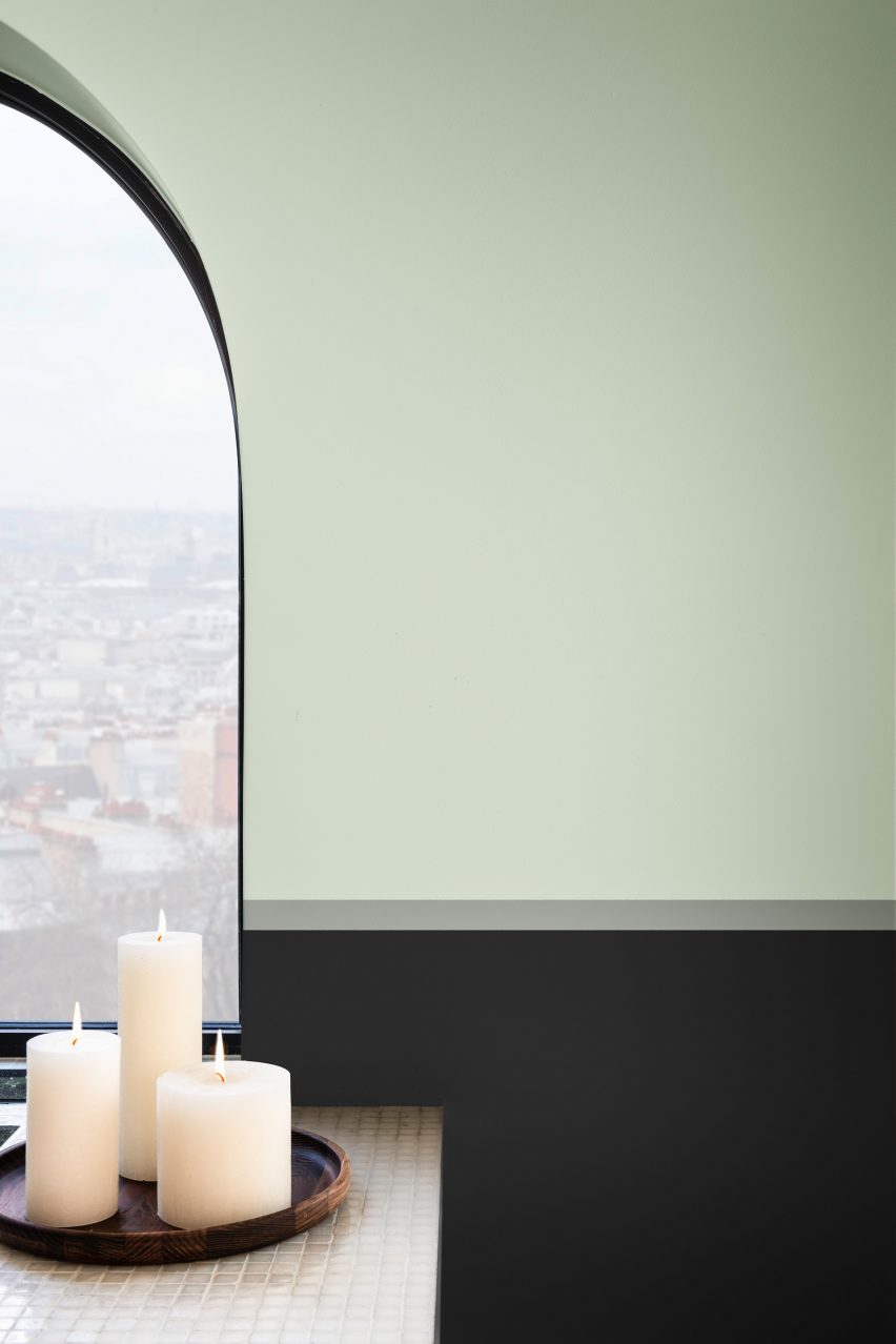
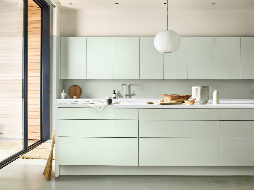
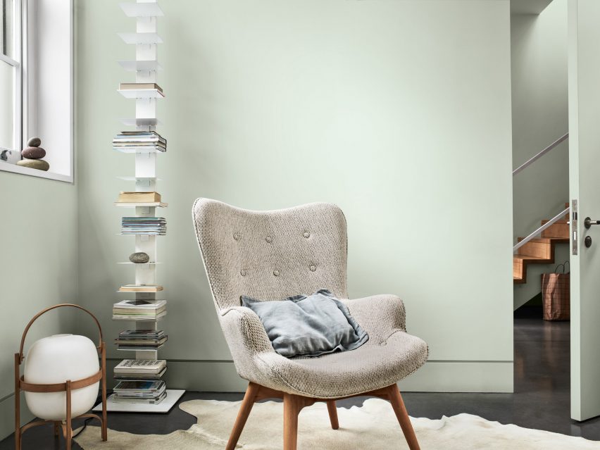
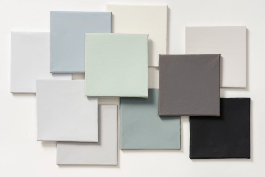
Tranquil Dawn’s green hue is also meant as a nod to elements of the natural landscape – Dulux’s UK creative director, Marianne Shillingford, compares the colour to “the space between the land and sky”.
“A new decade heralds a new dawn and the hazy pale green tones of Tranquil Dawn are calming and comforting just when we need it most in our lives,” she added.
“When paired with neutral pastels and rich jewels it becomes incredibly powerful at creating spaces that encourage making better human connections.”
Dulux named Spiced Honey – a warm, orange-brown hue – as its colour for 2019. The paint brand also created a complementary colour palette called Dream as part of its trends forecasts for the year.
Comprised of off-whites and soft beiges, the palette was intended to be “perfectly suited to the cold, wintry tones of the weather outside, allowing users of any space, room to let their minds wander”.
Last year Pantone named a peachy orange shade named Living Coral as its colour of the year for 2019. At the time Ogundehin criticised the choice, writing in an opinion piece on Dezeen that the choice “harks of naivety, not optimism”.